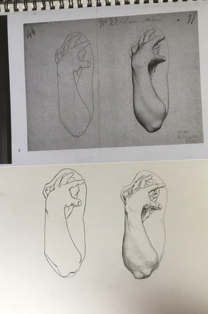
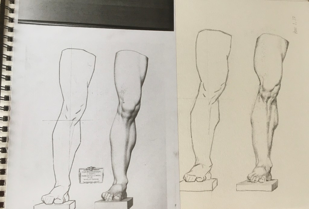
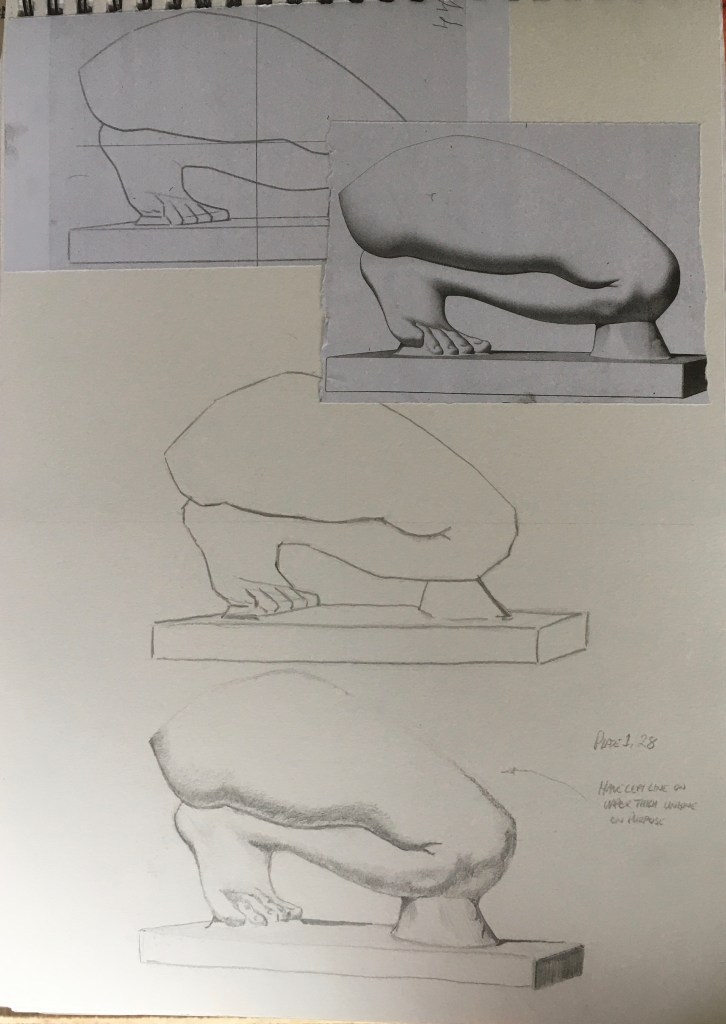
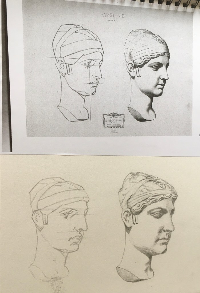
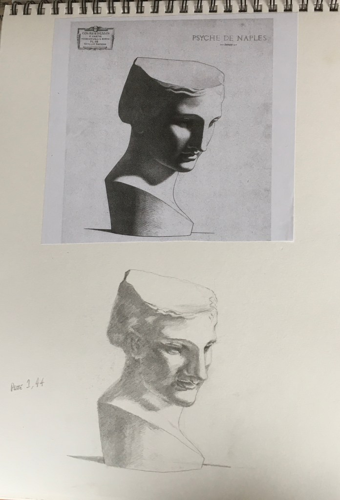
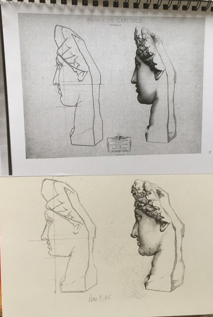
The following images are of my progression through the Charles Bargue and Jean-Leon Gerome Drawing Course which has been compiled by Gerald M. Ackerman ACR Edition 4th edition printed in 2017 in France by Presence Graphique – Monts. These plates have been used in Ateliers all over the world for around two hundred years and the purpose is to train the artists eye to simplify forms and identify line and tone in a drawing. This is a useful skill in portraiture and was one of the main reasons I decided to embark upon this task.
KEY LEARNING POINT
This self-imposed labour of love has provided me with a better understanding of the human form and the ability to identify simple abstract shapes which helps my drawing technique. The classical process was critical as a foundation from which I developed my own charcoal drawing process as can be seen in the time lapse of the charcoal and chalk self portrait on A2 toned paper in the Parallel Project where I mark out the placement of the facial features, but do it quickly, not with comparative measurement and sight size techniques like an atelier would teach. I combine this along with other things I have learnt from the relationship between line and tone – this is the topic of my critical essay.
I found that by working through this course I became more acutely aware of the importance of line and tone and their relationship with each other. Although this is a more classically oriented course, I see this as a foundation from which to build a more expressive way of working. I see a solid foundation in drawing skills as being beneficial in any practice and I have seen my own drawing technique benefit from understanding how to analyse and simplify forms into basic shapes. My aim is to explore further from this what drawing could be in terms of linear quality or tonal quality.


KEY LEARNING POINT
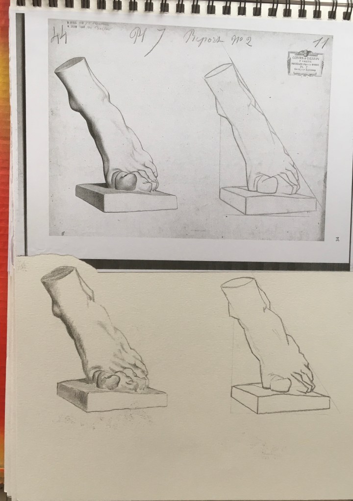
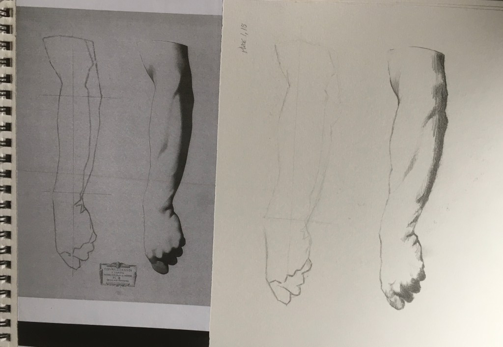
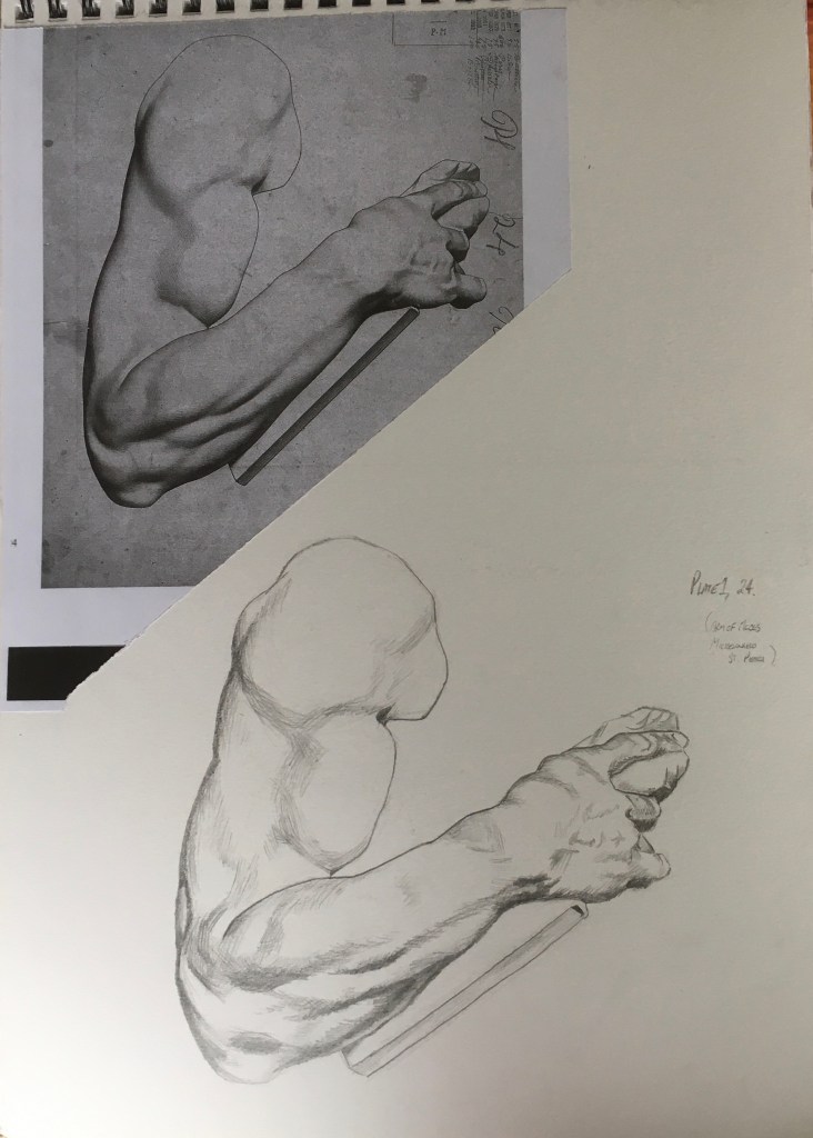
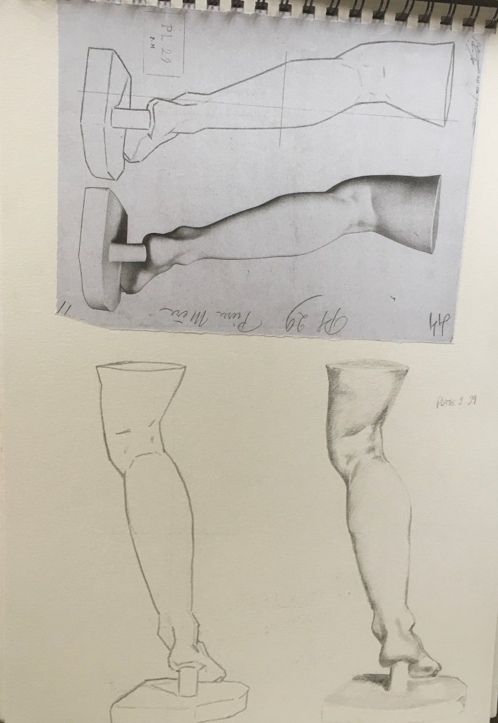
Arm of Moses cast above shows how line can describe the form both through thick and fine line to depict shadow and light and a curving line and cross hatch can describe the shape – as Rembrandt’s etching style shows – see Parallel Project self portrait drawings influenced by Rembrandt.


Key learning Point
All of these exercises inspired the exploration of the relationship between line and tone for critical essay.


Learning Points
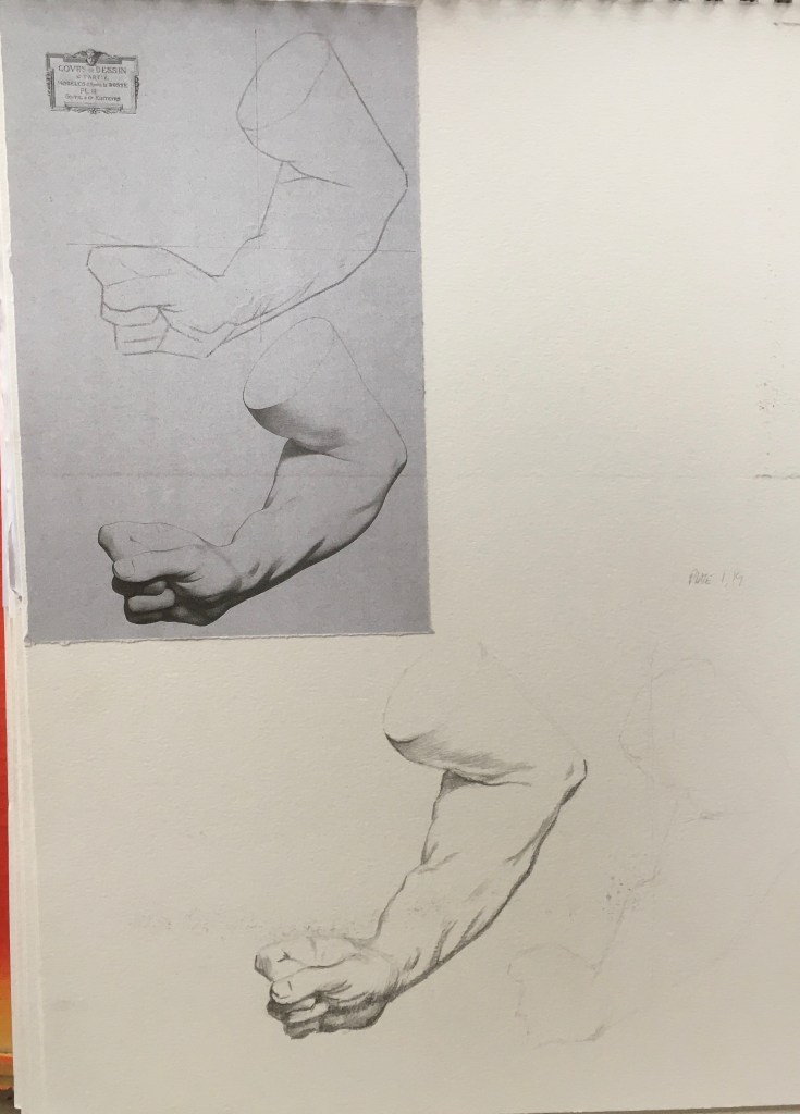
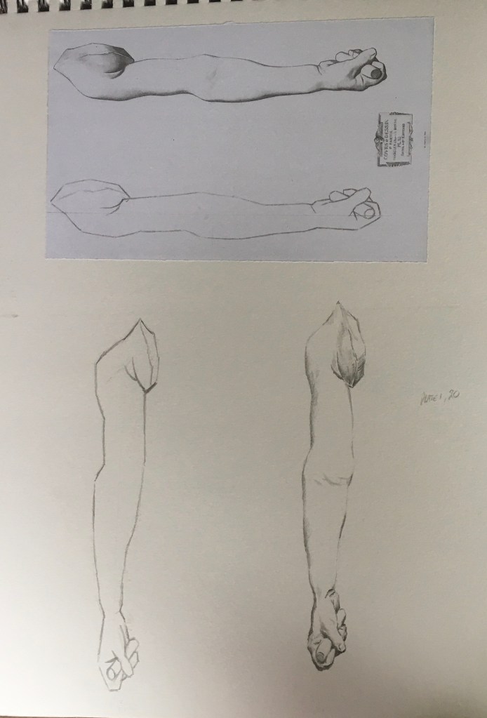
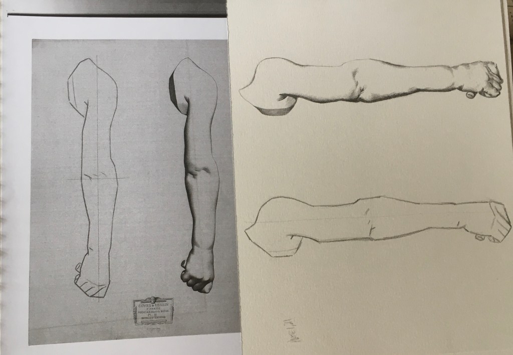
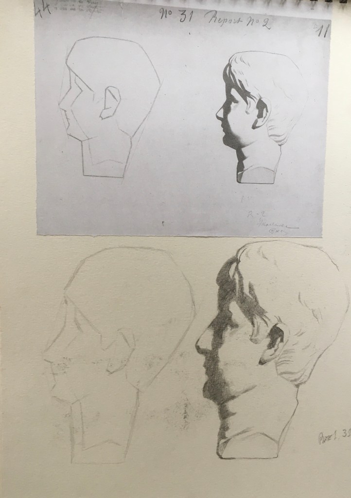
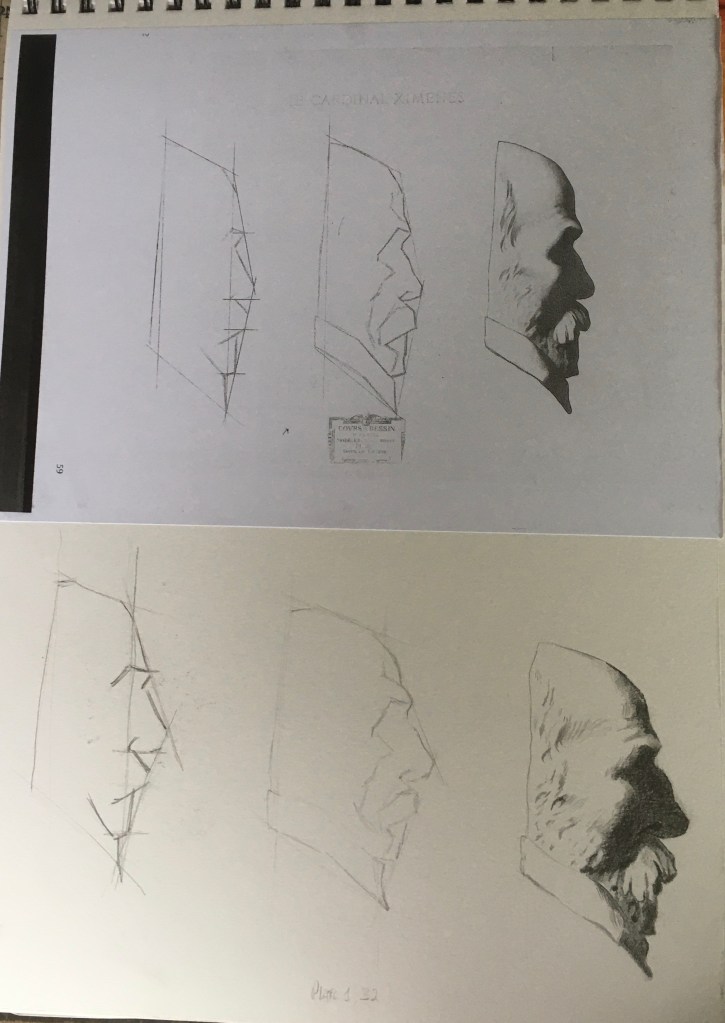
The importance of breaking the subject down into simple elements of shapes and straight lines which helps to identify proportion and scale before refining details of line and tone.
The discipline of drawing itself as discussed by Petherbridge (2010), Part One – Drawing as Continuum, Part Two – Linear Economy, and Part Three – Drawing as Discipline p.210-260 which informed my decision to carry on with the Bargue Drawing Course.
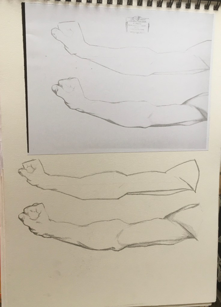
The subtlety of line can be a critical element in suggesting how light or shadow is hitting a plane, cross hatching with directional strokes can impart movement as well as suggesting the form of an object – see Rembrandt’s etchings in self portrait menu for parallel project for examples of this which influenced my own work.
The gradual or sudden change in tone helps to inform how quickly a form turns. The sharp contrast of light and dark will attract the eye to that area, this strong ‘Chiaroscuro’ was a favoured technique of Caravaggio, and again some of his works influenced my own self portraiture works – see self-portrait menu.
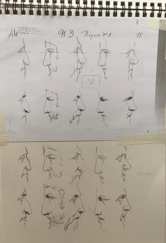
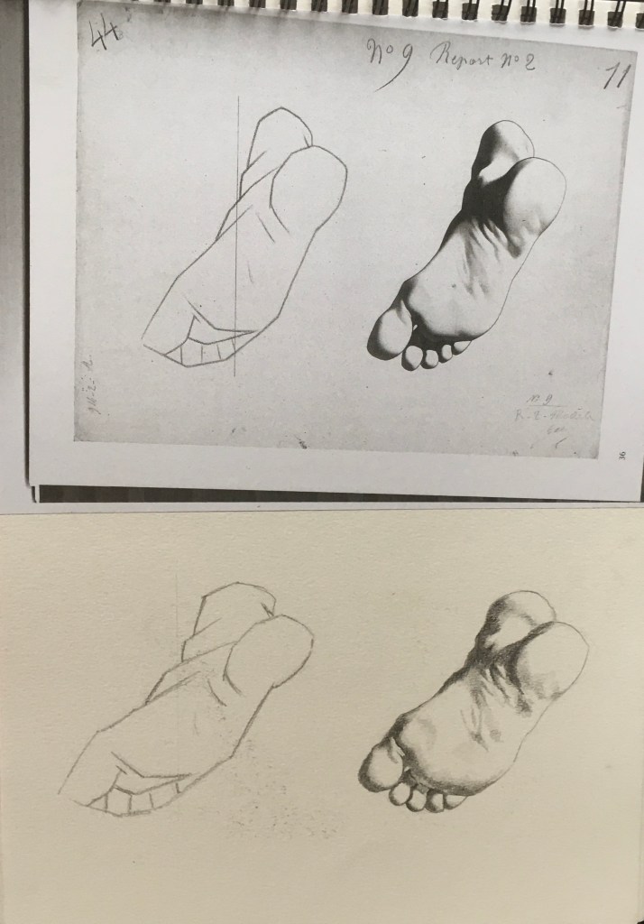
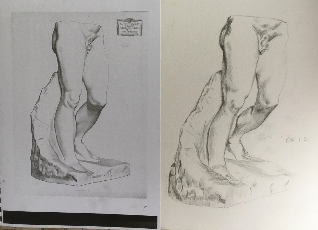
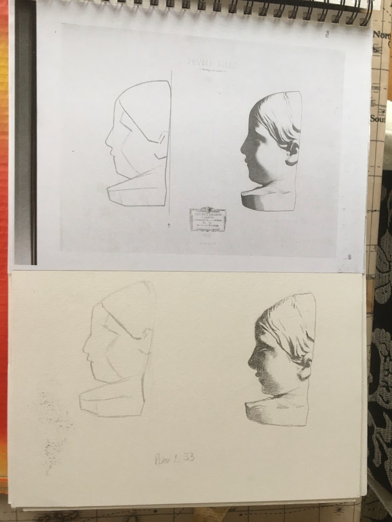
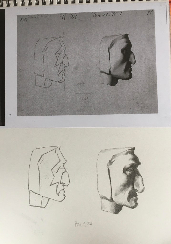
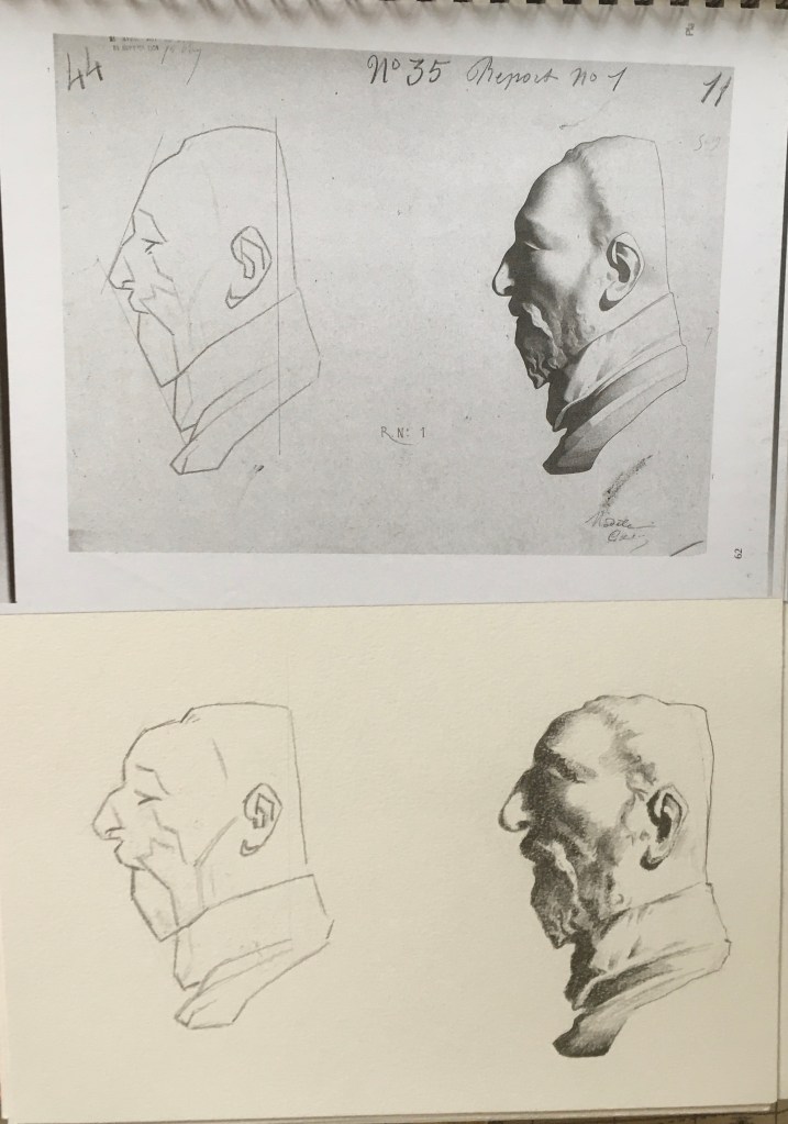
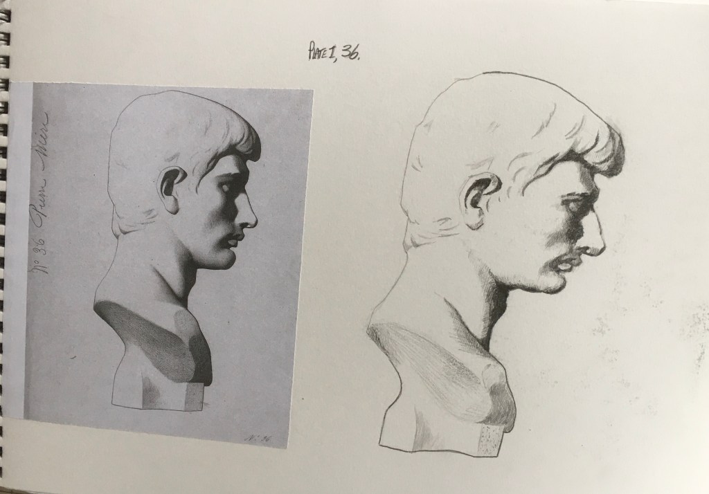
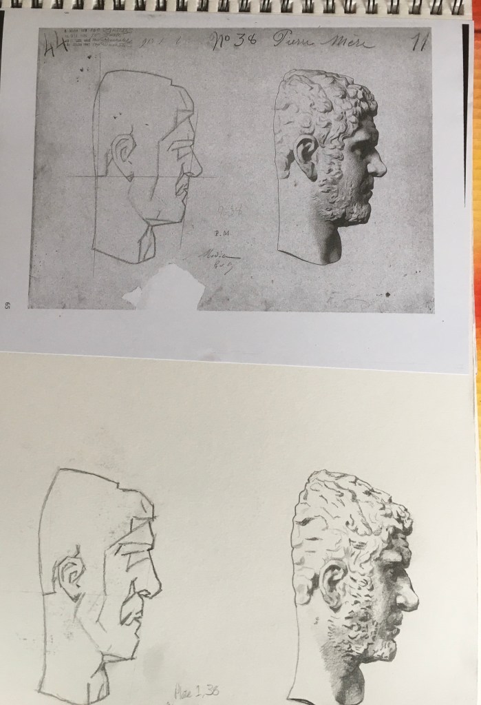
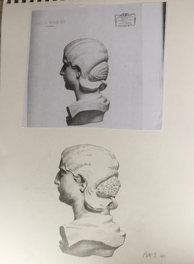
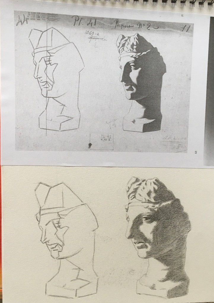
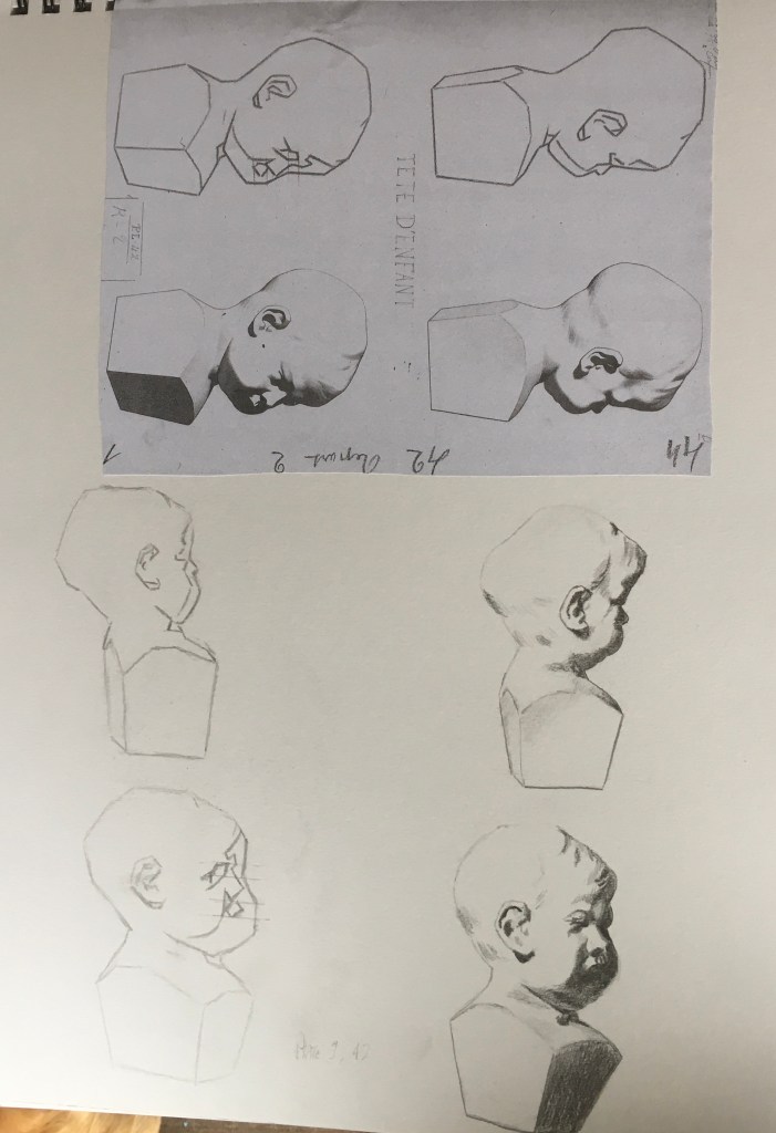
Copying masters work is a good way to train your eye to identify natural beauty, they have done the selective work for you.
Sight size is a good technique to help inform the artists understanding of objects, in this case the human form, I didn’t always adopt this practice and it does show in a few cases. I was a bit less precious about the time I spent on each plate to get each one perfect. My tutor did stress it would be a better practice for me to spend less time on each drawing and do more drawings to inform my practice. Rather than spend ten or eleven hours on one drawing to get it really accurate, I spent on average no more than two or three hours on each plate copy. I am painfully aware that there are errors in scale and tone in several drawings when compared to the original sources. For this reason I was working on A4 size in my A3 sketchpad, and I would have liked to do larger studies, I think this might happen as my journey continues as I explore the relationship between line and tone.
SOURCES
Bargue, Charles and Gerome, Jean-Leon, 2003, ‘Drawing Course’, Gerald M. Ackerman, ACR Edition Paris.
Petherbridge, Deanna, 2010, ‘The Primacy of Drawing – Histories and theories of practice’, Yale University Press New Haven and London.
