Project 1
Exploring Composition
“Aim : When you’re drawing from observation it’s all too easy to make assumptions about your subject and take certain elements at face value. This project encourages you to reflect on the wider potential of observational drawing, in particular how you can use what you look at more experimentally as you develop your composition. You probably normally start by finding an interesting subject or setting up a still life. This project asks you to reverse this process by finding what may seem an initially unpromising subject, but one with several elements, and then building up the composition to create an interesting drawing. This will encourage you to reflect on the potential of a more creative and open-ended approach to composing drawings. “
“Method : Find an inconspicuous area of a room or small outdoors where several elements are juxtaposed. Take photo’s and make sketches of cropped details. Make several drawings, playing with the composition of the elements. Allow interesting features to develop; extend lines, repeat motifs, allow forms to come together in unusual ways. Be as playful as possible with pattern, texture, form, etc, whilst still being sensitive to what you’re looking at. You may find that photocopying your drawing, cutting it up and making a collage will help – or overlaying tracing paper to create repetitions of interesting lines and shapes. As you progress you may find that parts of the subject which feature large in reality disappear completely in your drawing, while incidental patterns of shapes develop their own status.”
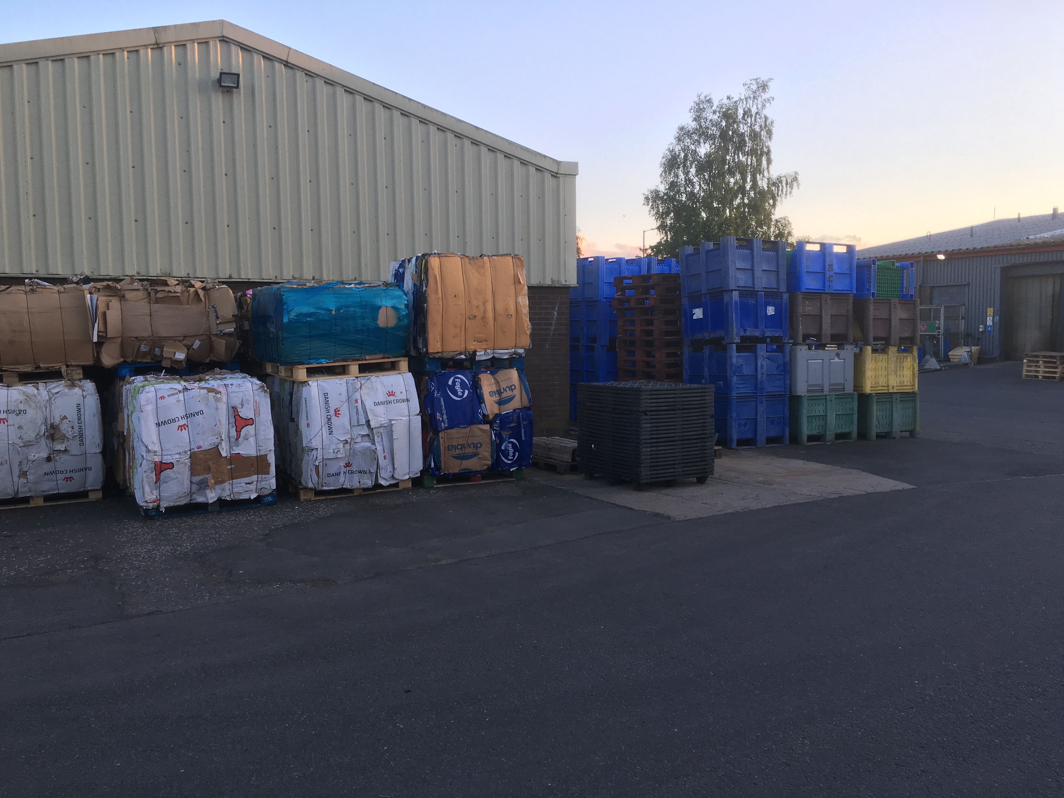
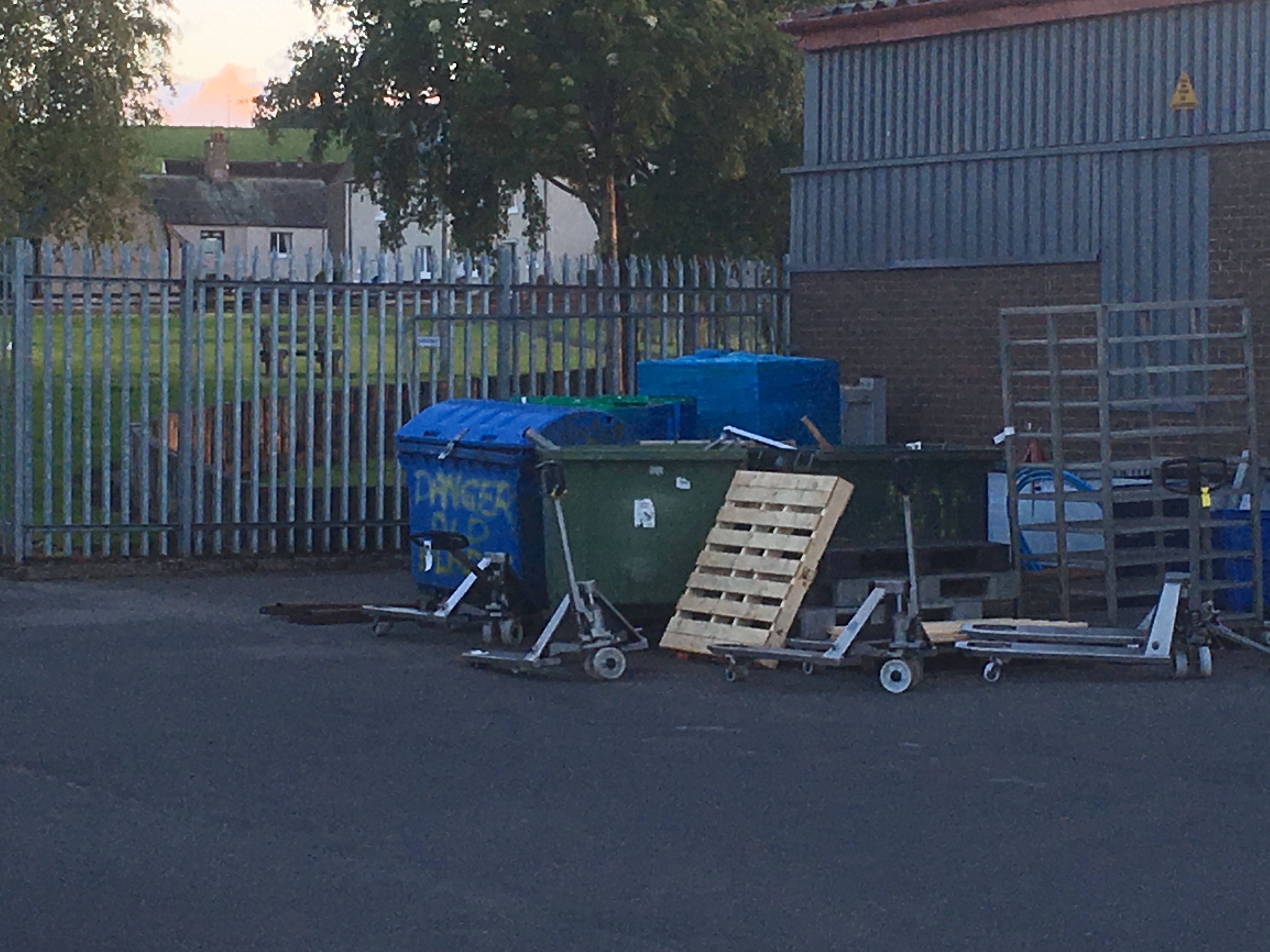
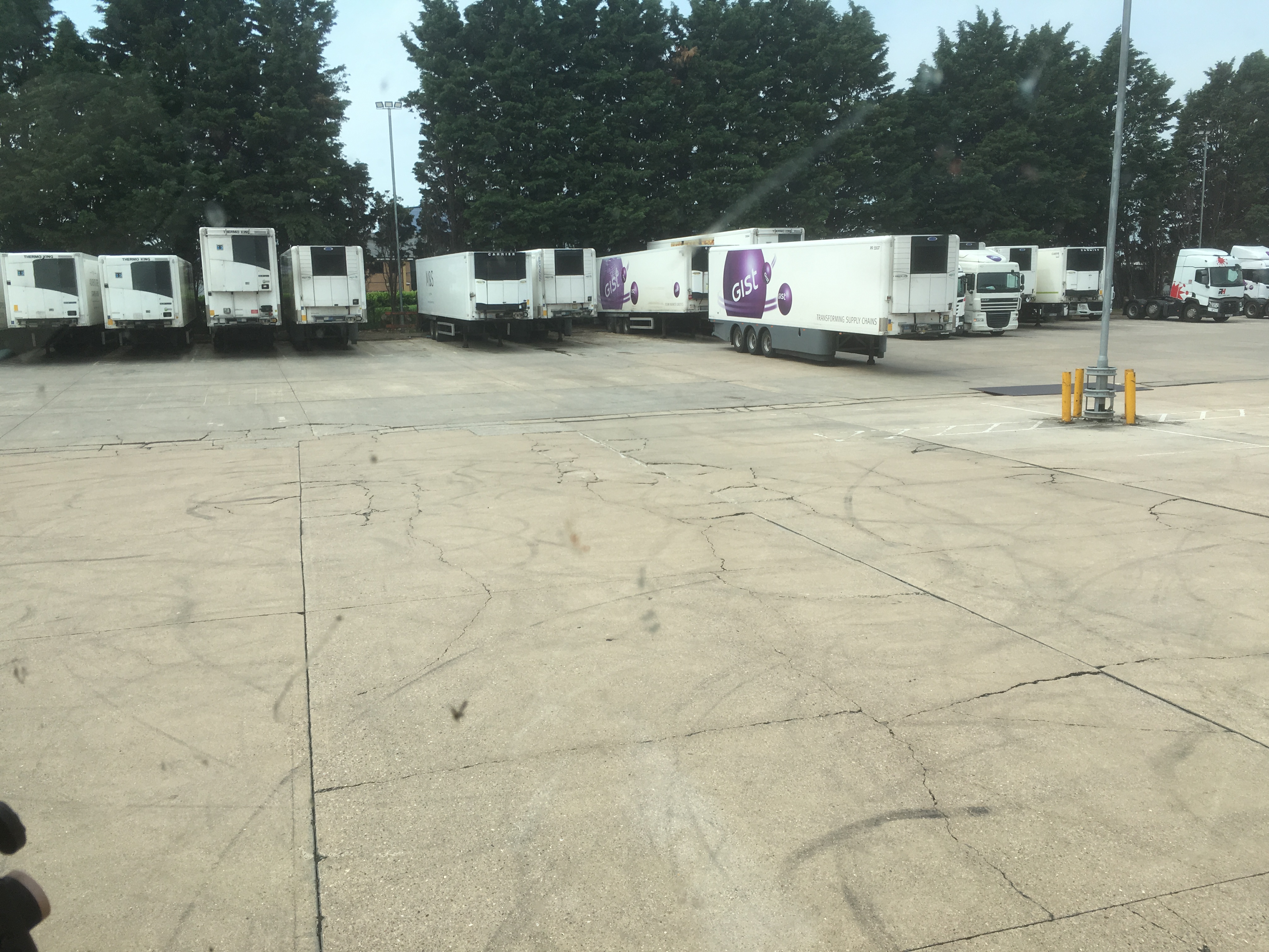
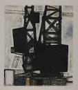
Working as an HGV driver, I see some interesting depots and yards. I took some photo’s around some of the factory and depot where I am based.
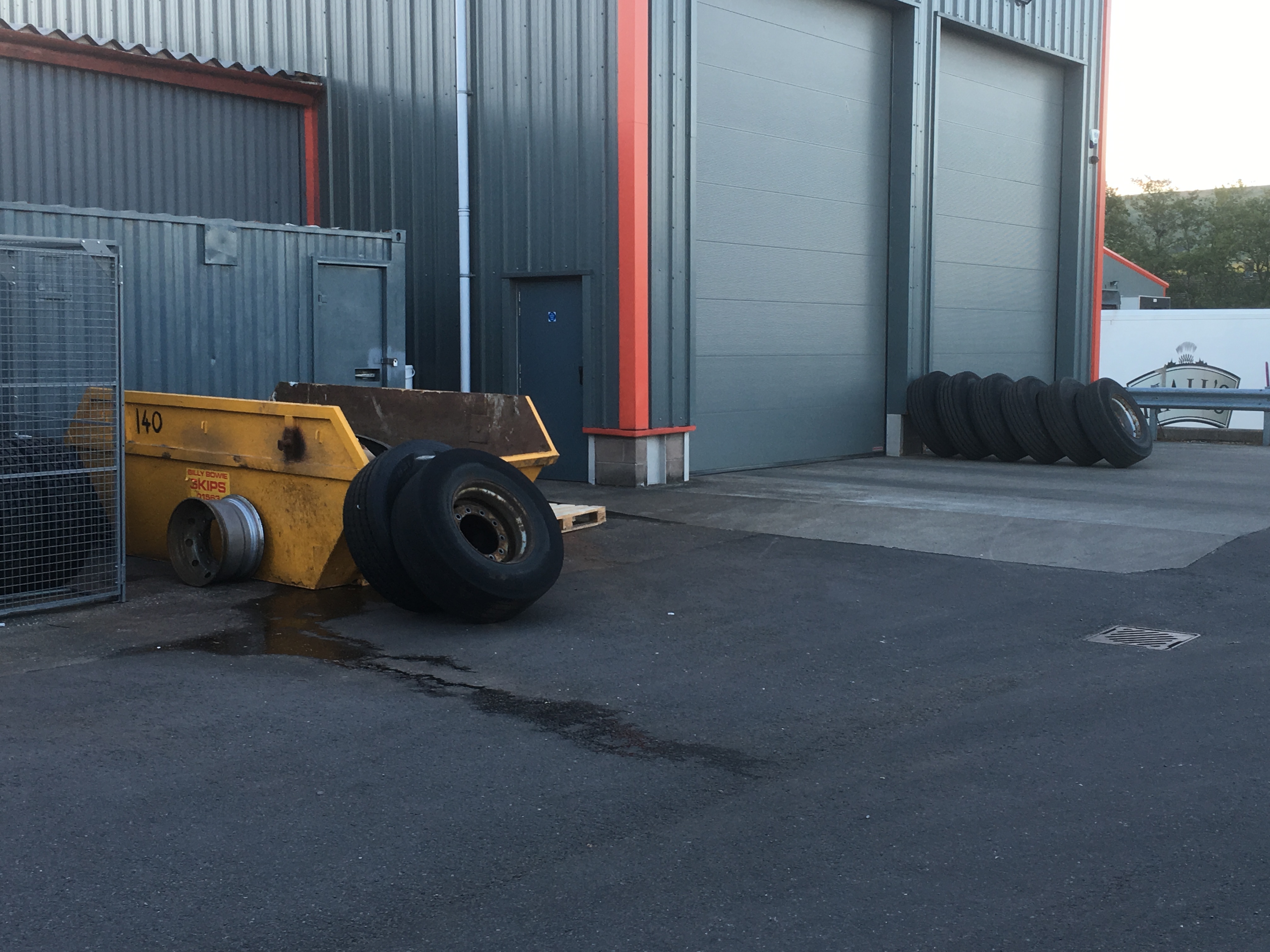
Taking the image above as a source, I produced some thumb nail sketches using different mediums and cropping inn on certain points to focus on tonal values rather than detail in order to draw the abstraction and search for patterns that were less obvious.
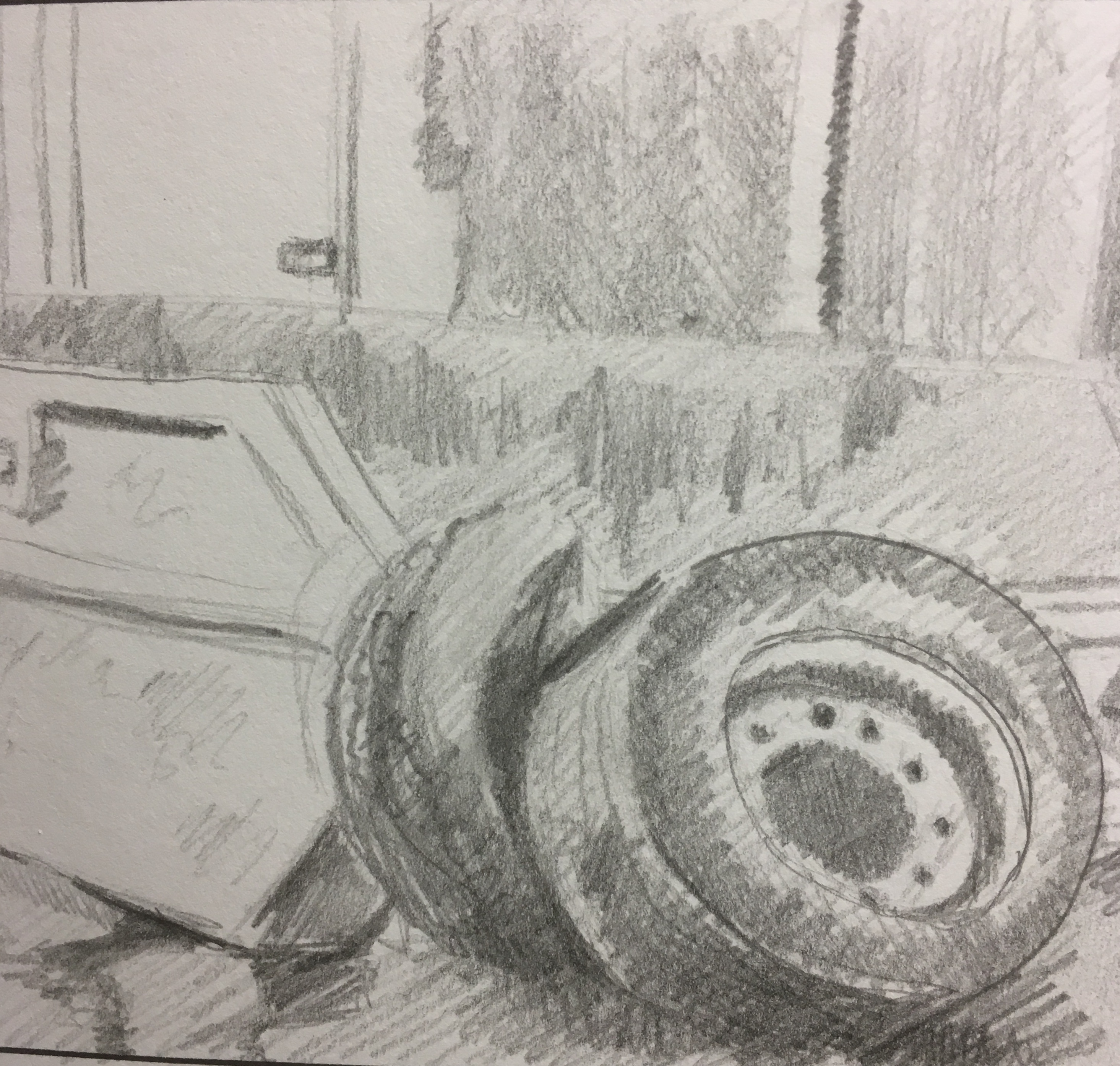


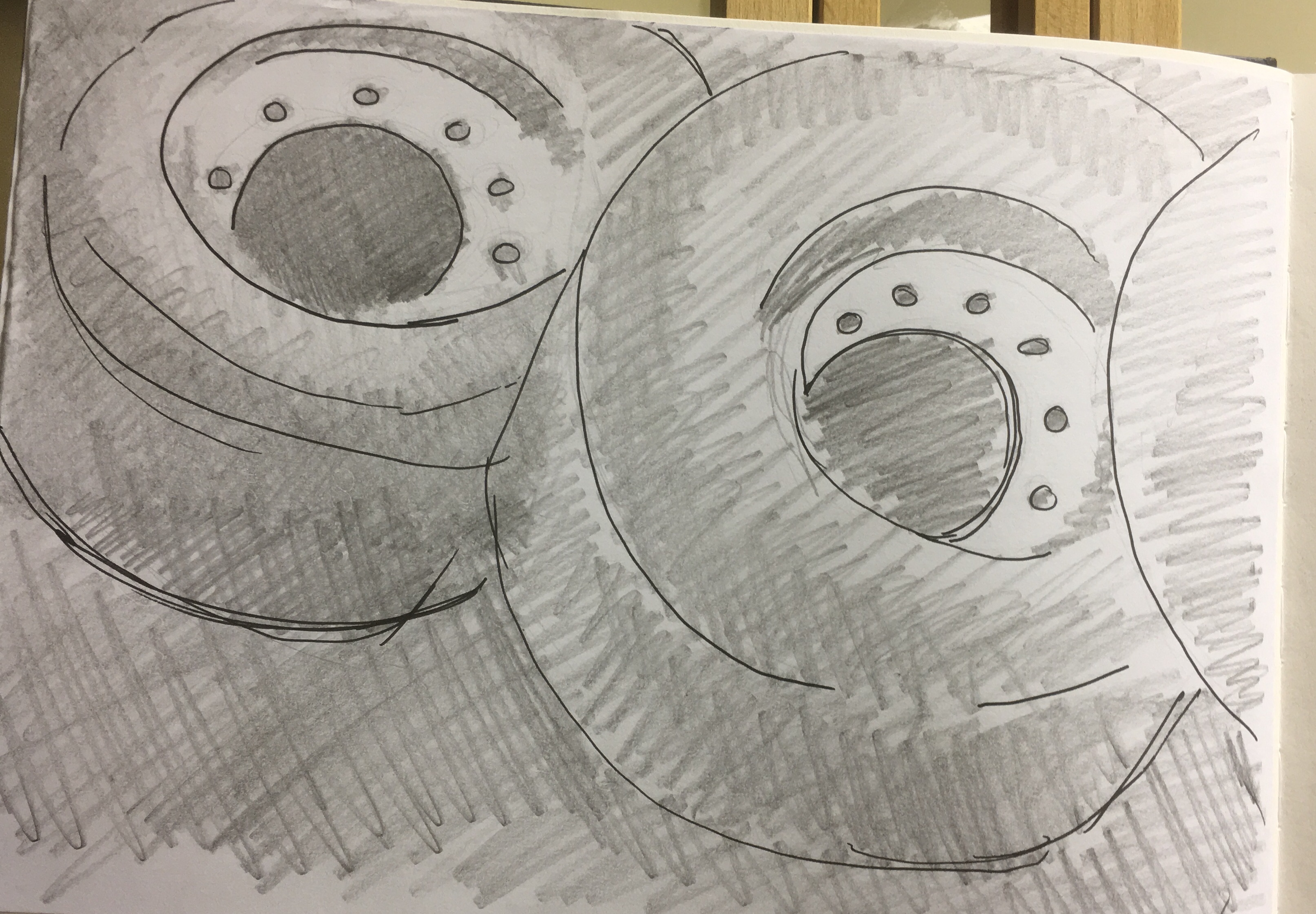
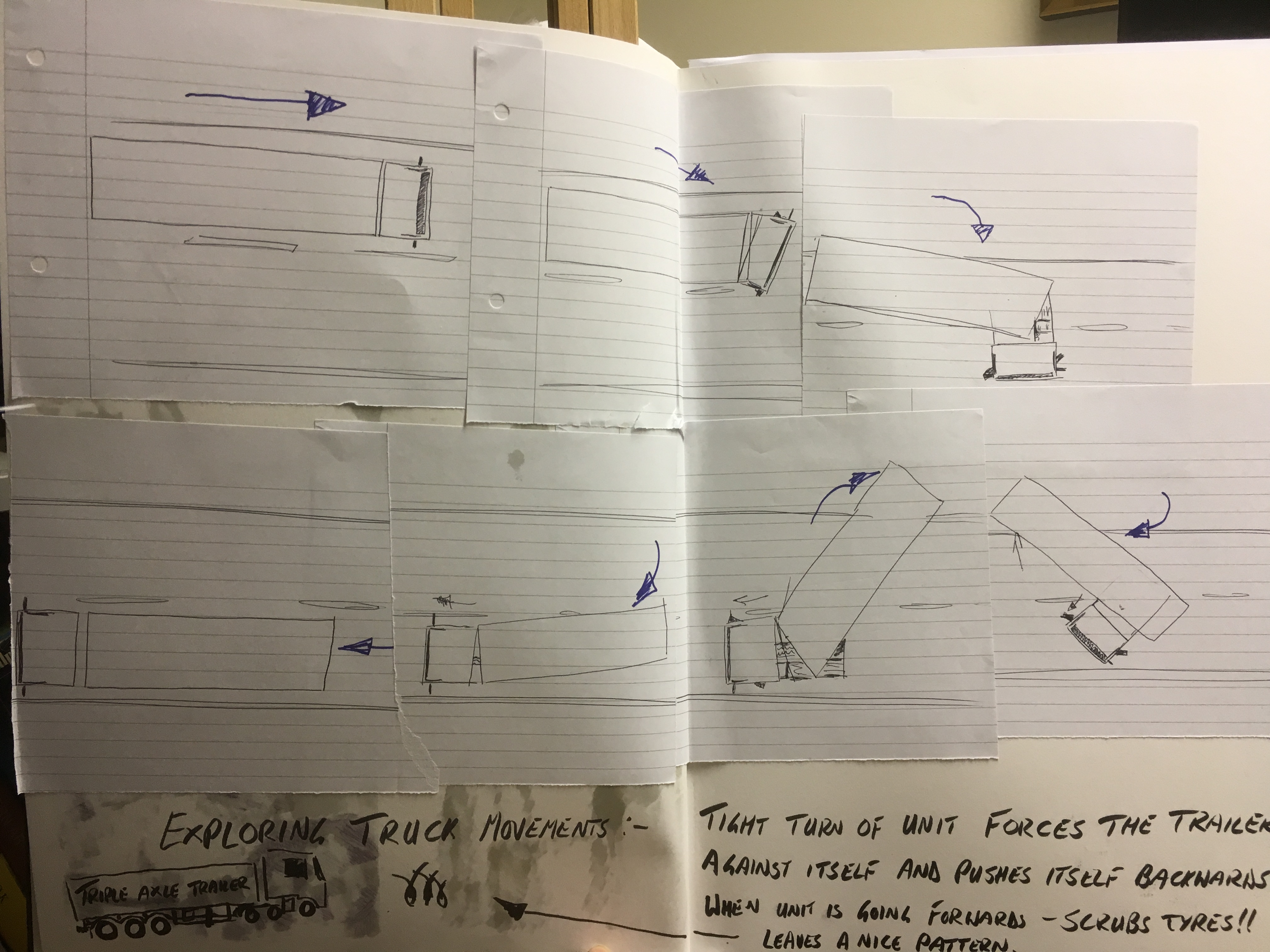
Looking at the damaged tyres that were the main focus here made me consider the main cause of damage to tyres, scrubbing by turning very sharply or with flat spots due to harsh braking. Any haulage yard will have tyre scrub marks from where trailers have to be turned in a tight circle to fit into a particular loading bay.

The following YouTube video shows the forces acting on a trailer during a very sharp turn will actually push it backwards while the unit is moving forwards.
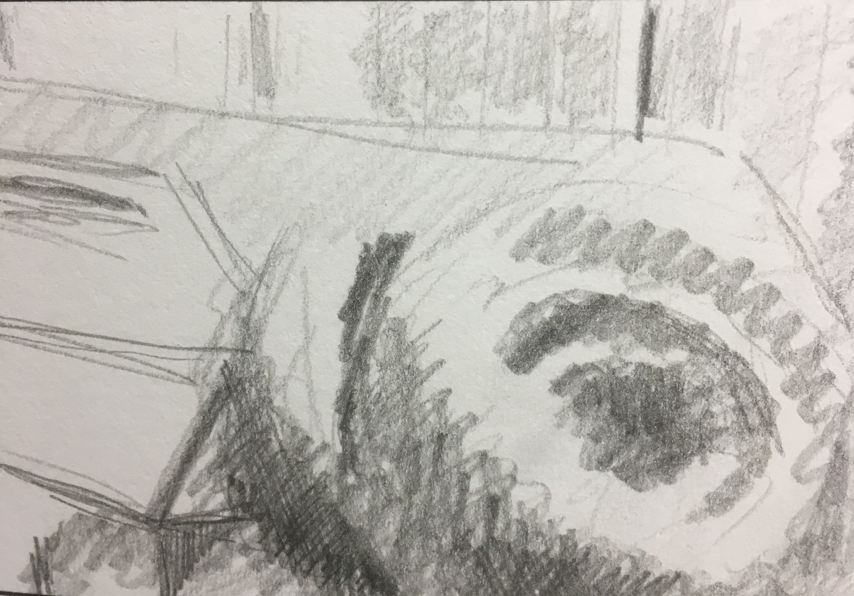
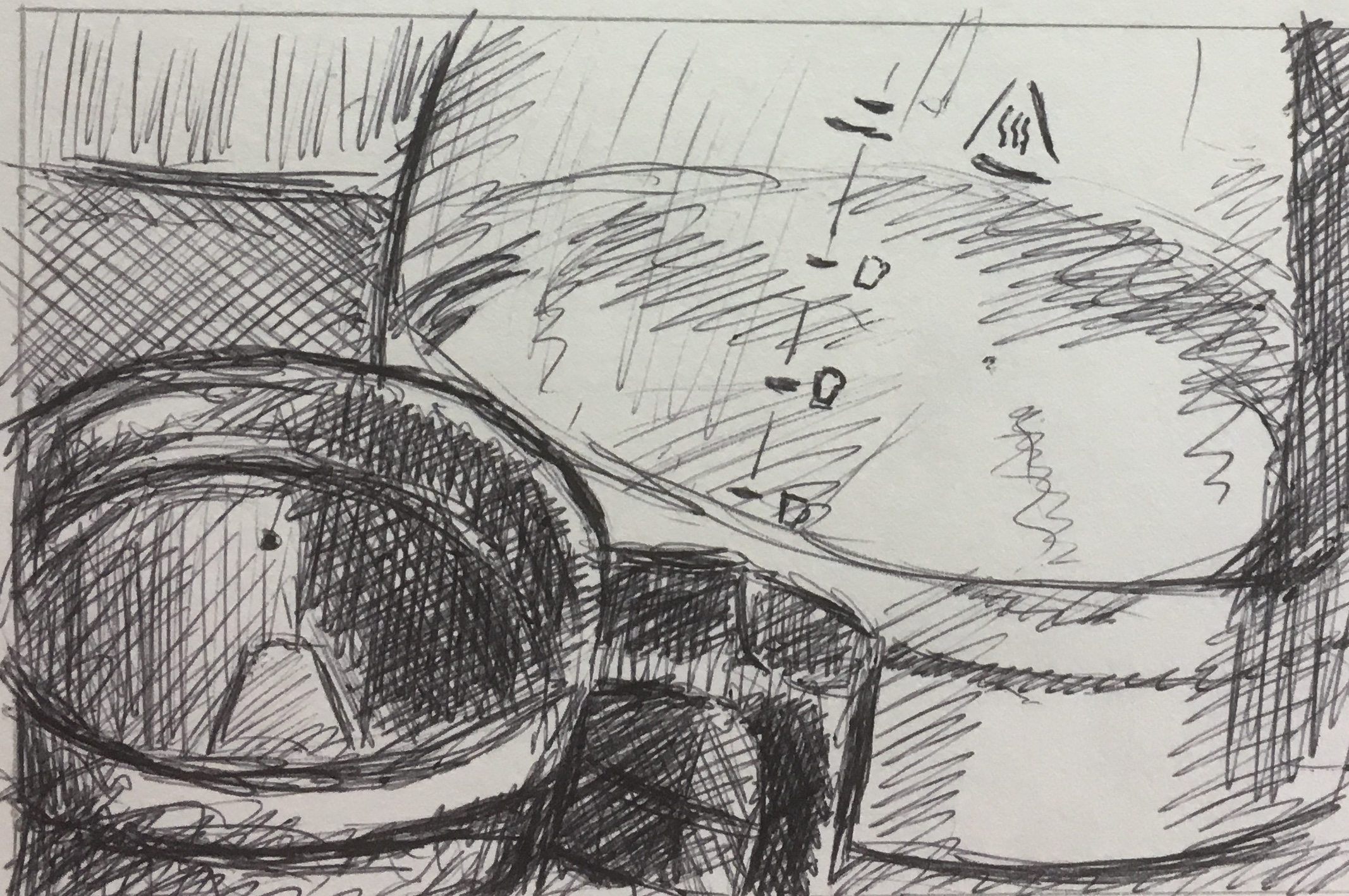
The idea of truck movements made me think about the different arcs the trailer and the unit make and I drew a series of sketches to put in my sketchpad to illustrate the movement shown in the video above.
The idea of truck movements then made me consider the fact that most trucks within a fleet will have a tracker fitted in order for the haulage firm to be able to see at a glance where any vehicle is at any given moment. That combined with digital tacho heads in the cab to record the drivers activities between driving, working, and rest to account for every single minute of the day made me realise that the truck is making a mark just by driving around. I asked the company for a copy of the journey I had made that previous nightshift from Gist’s Spalding depot up to Gist Cumbernauld and back to our depot near Sanquhar in South West Scotland.


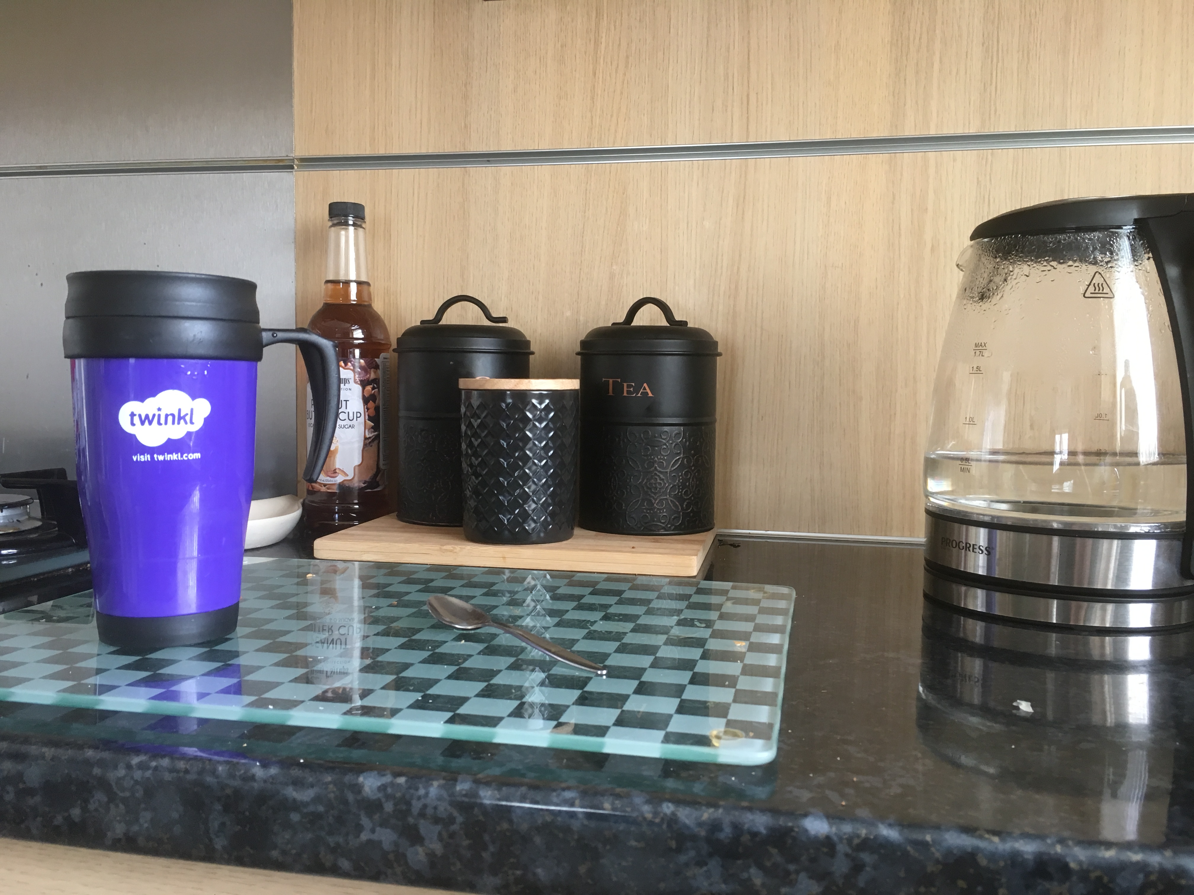
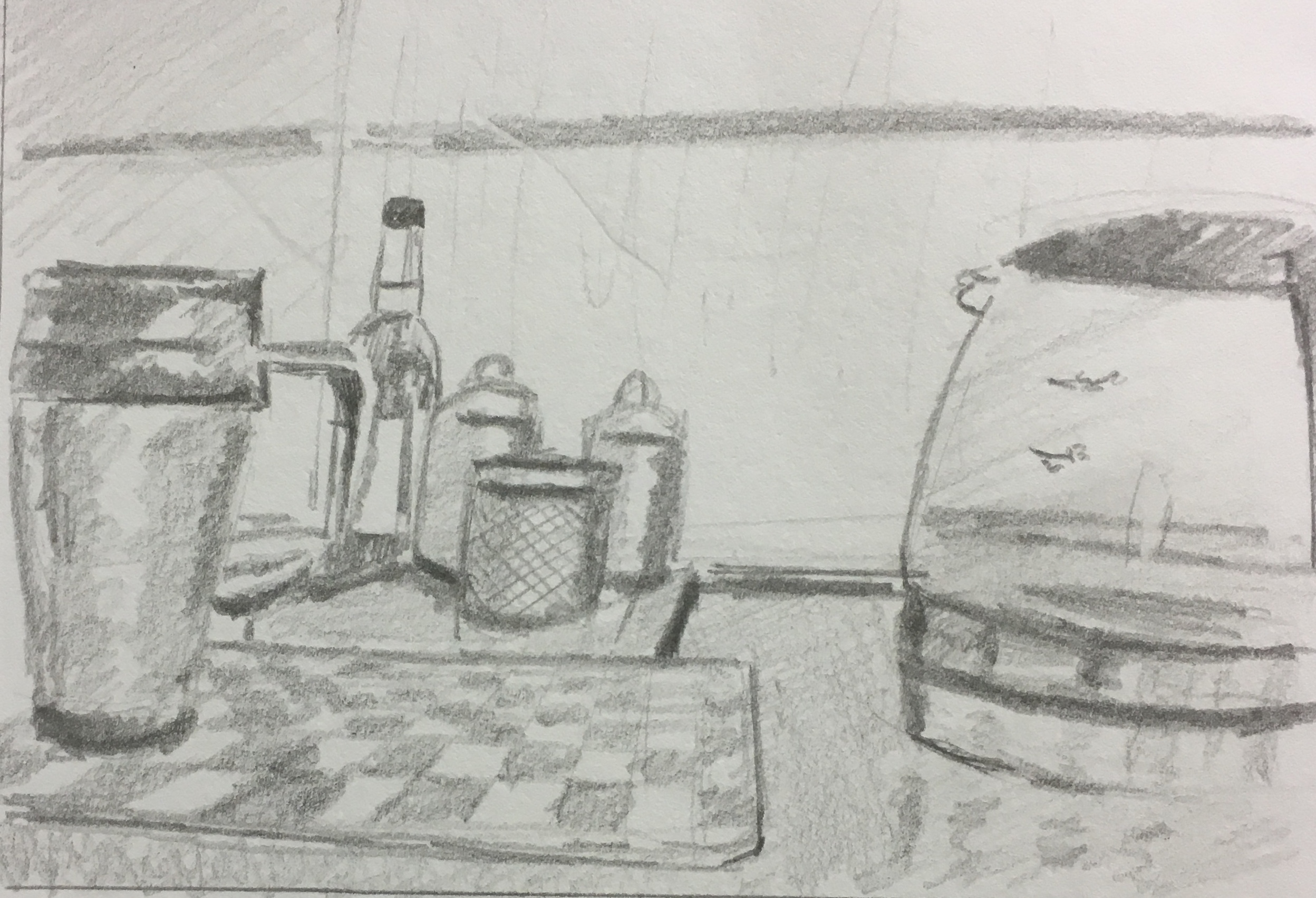
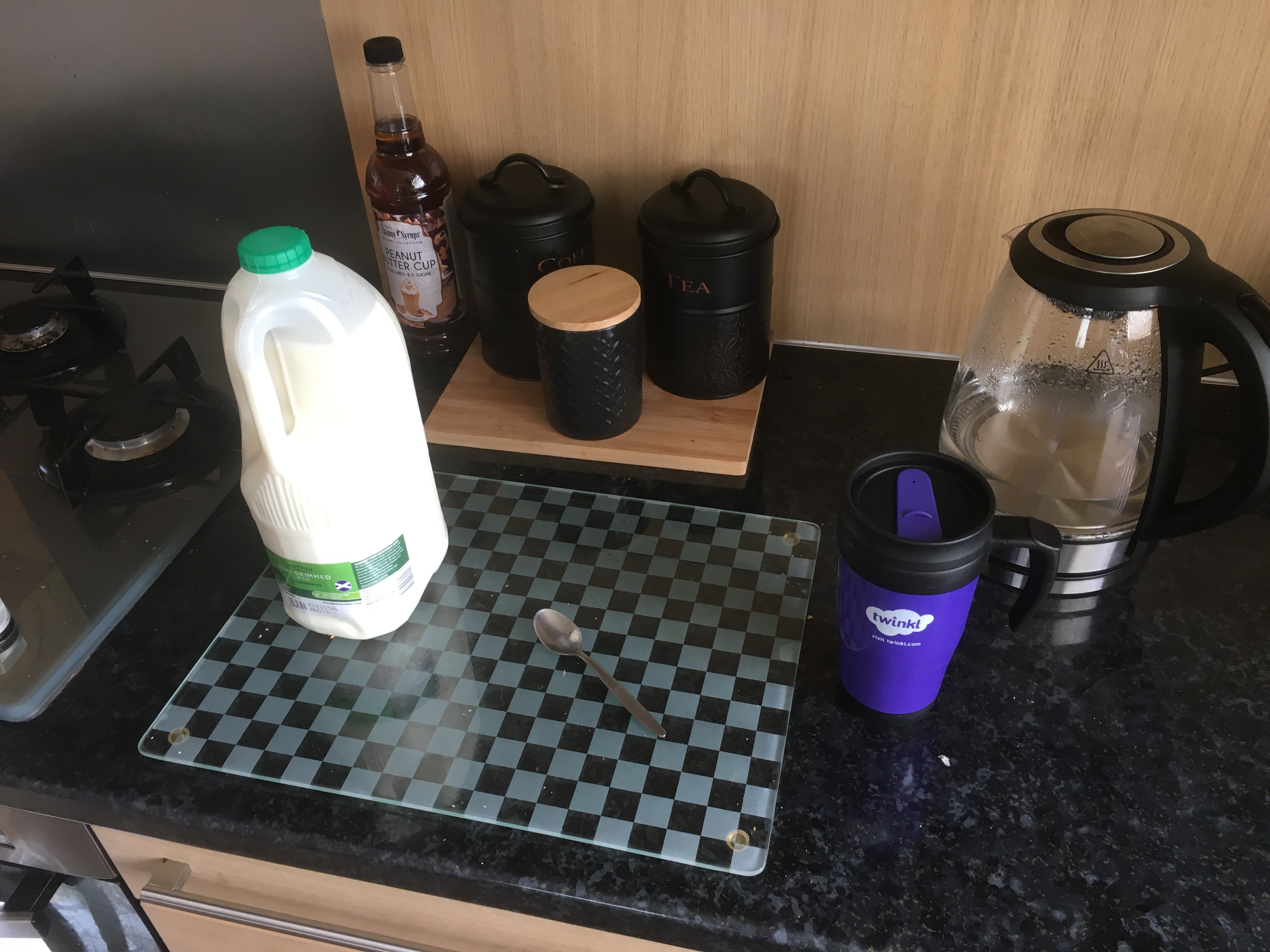
Considered a domestic interior scene with the simple story of making a cup of tea.
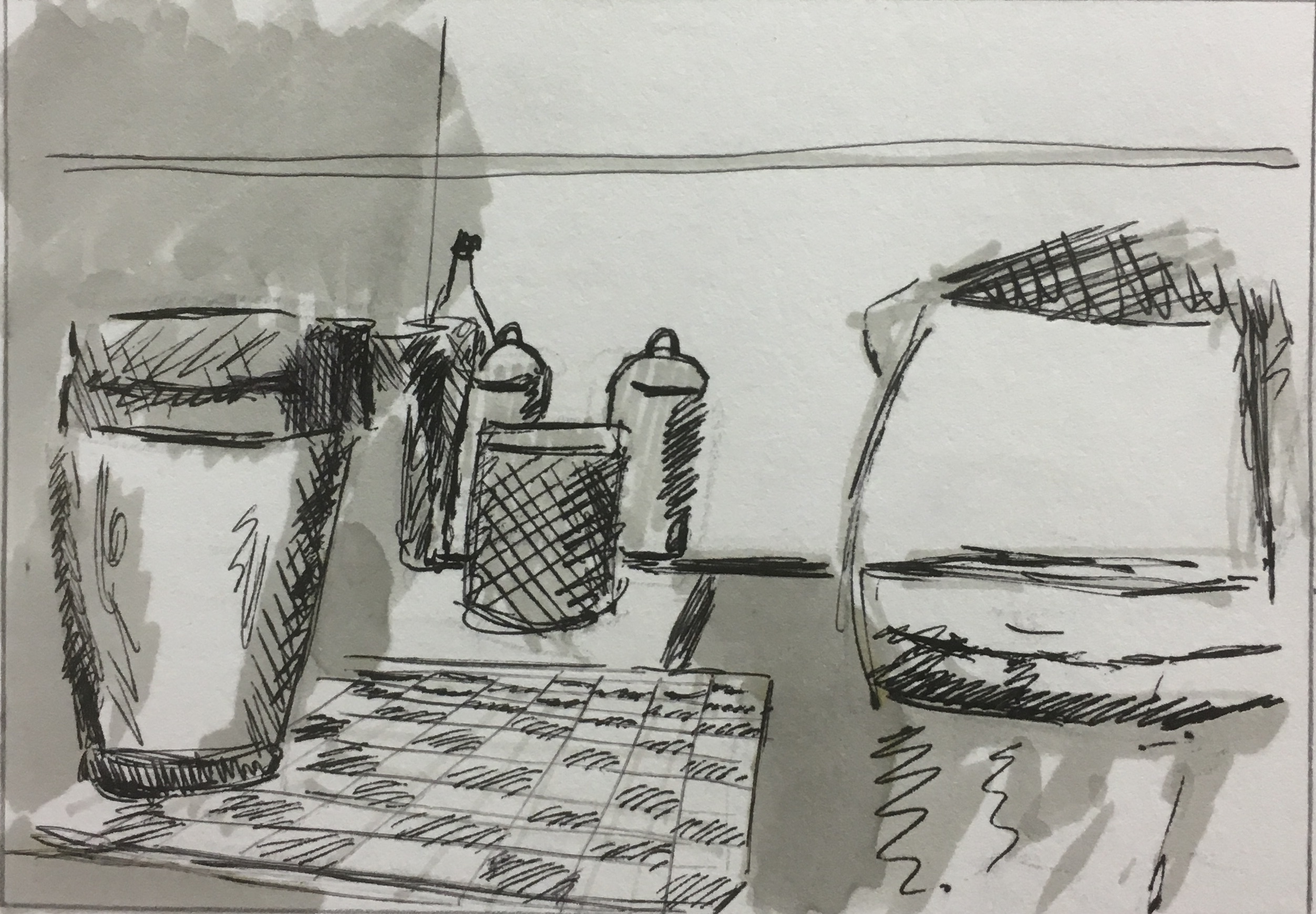
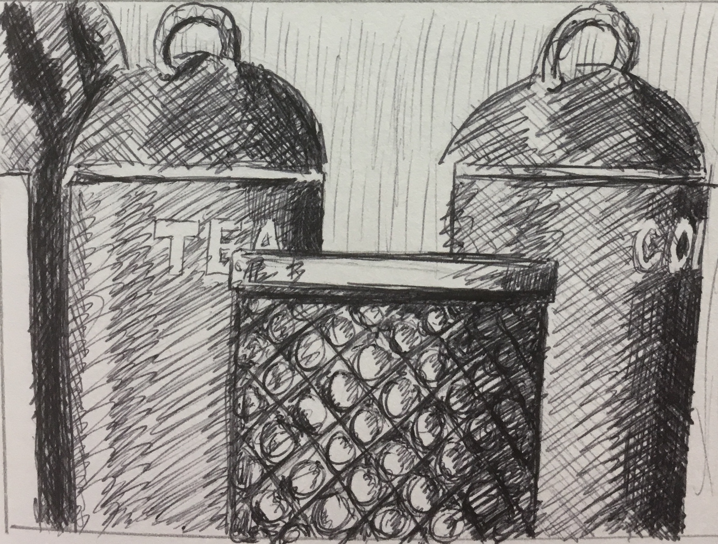
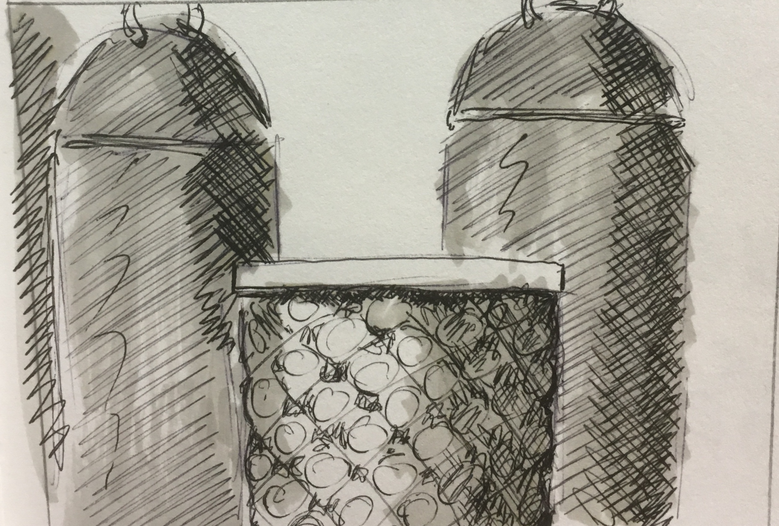
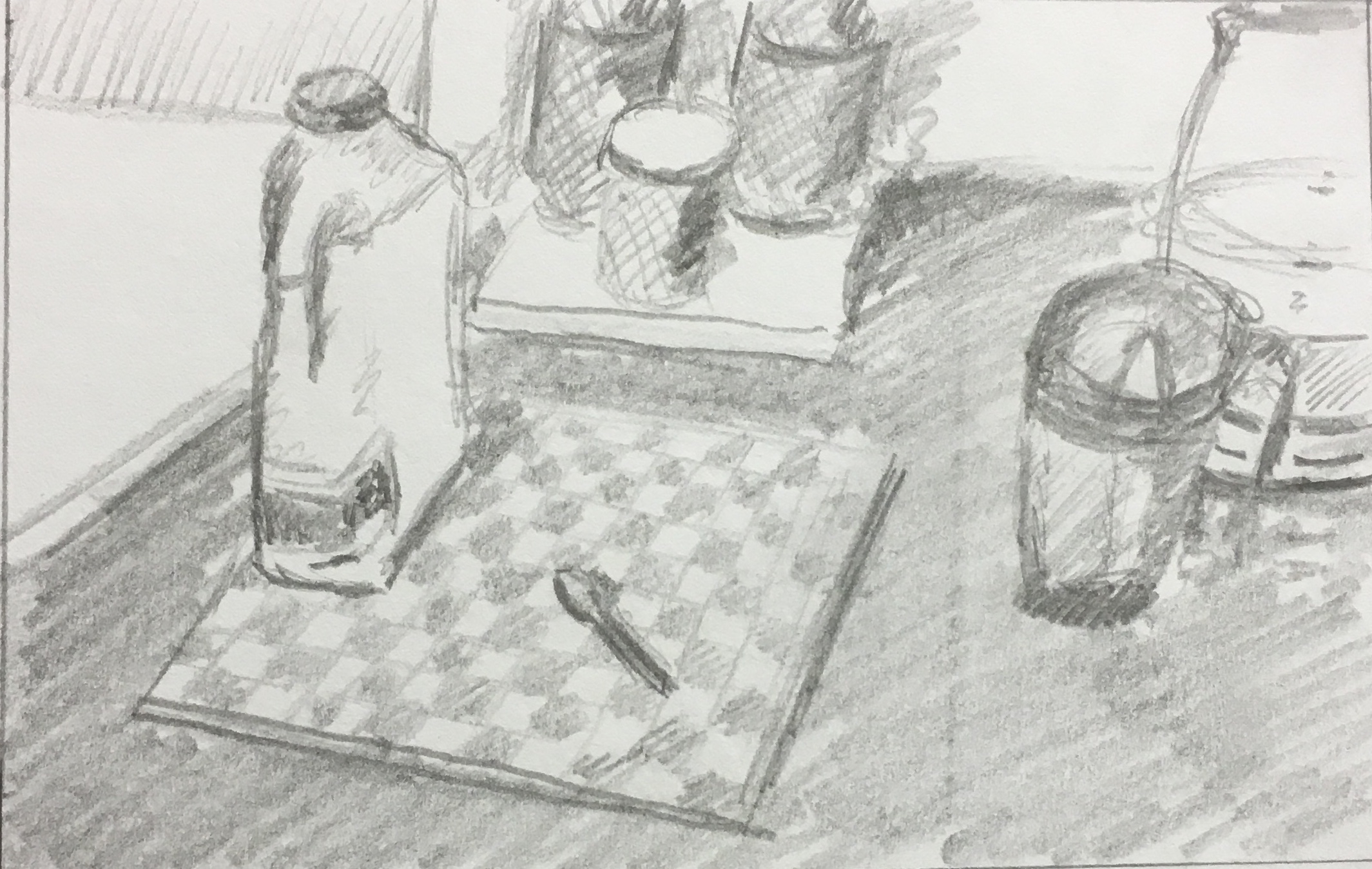
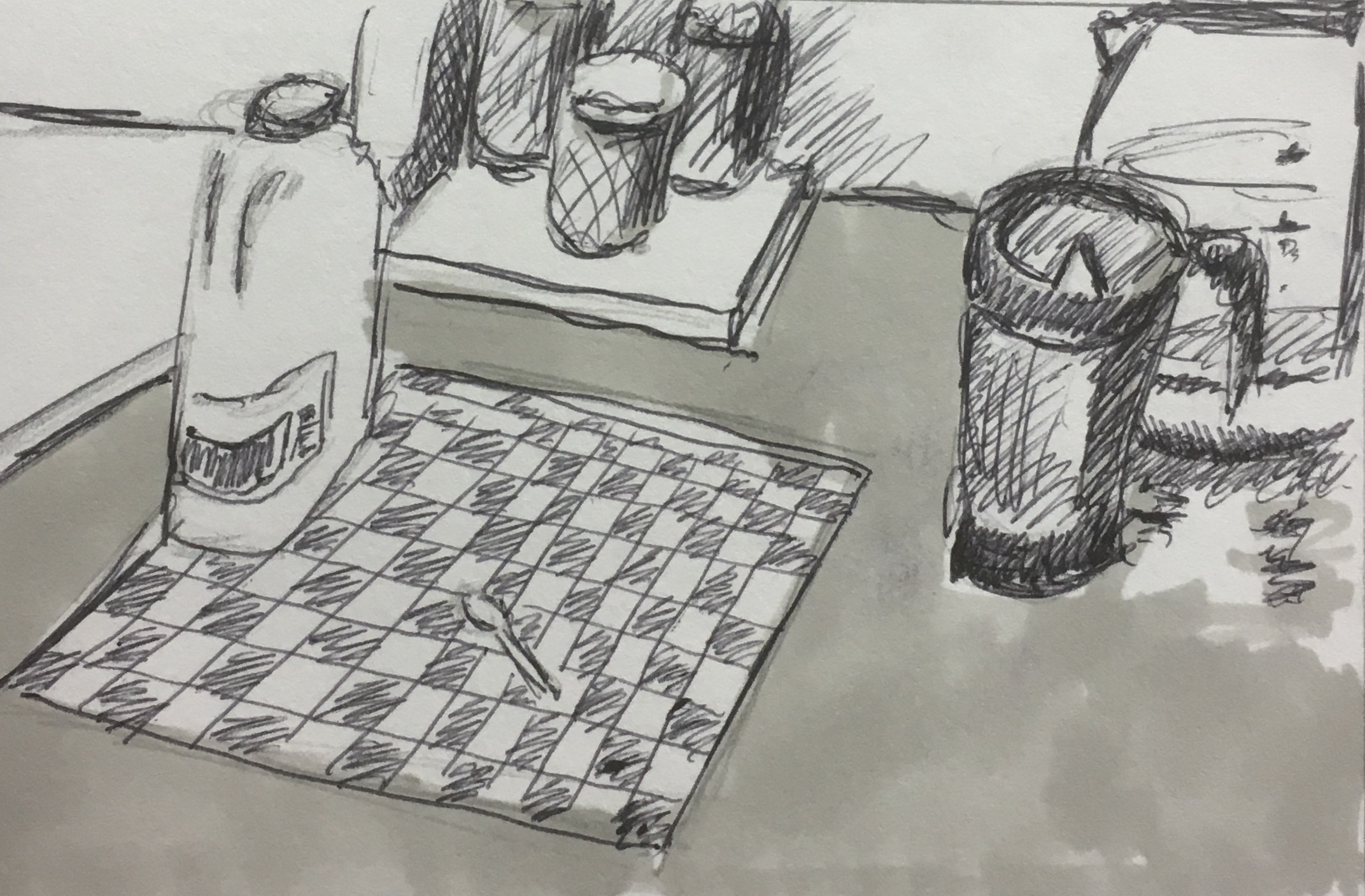

I tried to approach each of these different compositions with the same process of exploring different tonal studies and cropping in on certain points to achieve abstraction of form within the composition. I was interested to note the difference in each different thumbnail sketch to the original source just by pushing tonal values or by cropping in to a certain point to alter the composition.
Reflect on whether you’ve made the best possible use of the space available to you. Are some areas simply ‘background’? What more could you have done to develop these areas of your drawing?“
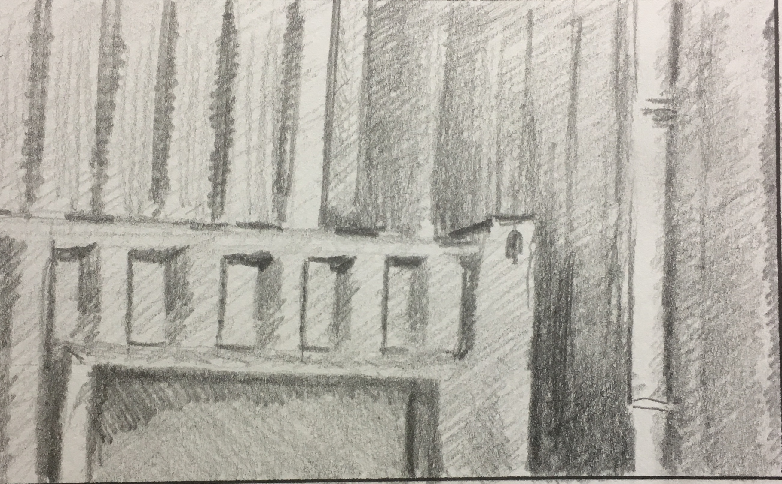
Taking the above learning point about how different applications of tonal value can alter the importance of a piece within the composition by providing depth. Some of the repeating shapes and patterns such as the grooved portacabin walls were an essential part of the background, yet they could be just hinted at with a suggestion of line and tone. The use of colour might have been an interesting concept to experiment with,for example, cool colours going into the background and warm colours could leap forwards into the foreground. Perhaps using colour pencil or felt tips might have added to the experimentation. – (See Assignment 1 final outcome).
“Reflection : In your learning log, reflect on how far you’ve moved from your original subject. Is your final drawing still of the object, or is it more a drawing about the process of looking and being creative?
LEARNING POINT
The exercise did ask that we should “remain sensitive” to the Still Life image so I did try to retain a large element of realism to the sketches and explore more in terms of tone and shapes through cropping in as a creative process. I did become aware that I began searching for something interesting in a set up that would not normally have interested me greatly and I started by squinting to remove the detail and identify tonal values, then I would look for interesting shapes so there was a work process that took over rather than a piqued interest that was driving me to sketch and draw. The learning point for me here was that something good or interesting can always be found if you look for it. Taking the example of the yard still life which has quite a lot of negative space and vertical lines, to then finish up with a repeating pattern of a cropped in study of one element of the piece which contains a lot of ellipses does show quite a departure from the original source image. The cup of tea Still Life also shows the potential to alter the drawing by focusing on the background elements in the case of the jars and cropping in on them which made a background feature a now dominant feature with repeating lines and rhythm. Again, the process for me is still being true to the object, but still finding some abstraction. My thought process starting from damaged tyres through to causes for wear and tear to patterns on tarmac from those movements to end up with the mark a trucks journey within the UK mainland makes on a computer screen, is somewhat removed from the original Still Life composition that is uninteresting. I would not normally think about drawing or mark making in this way, I am normally very classical in my views towards seeing objects and representing them. This is probably the first time my imagination has run away with an idea.
Project 2 : Using Space
“Aim : Start by looking at the work of Elizabeth Blackadder (see vimeo.com/25711526). Elizabeth Blackadder works extensively with still life. The objects she works from are often quite small and her compositions leave a lot of space around each object. The space is not ‘background’ , however, it’s a vital component of the composition and the formal properties, especially the colour and scale, are used expressively. A small brightly coloured object might be balanced by a very large square of a darker colour, for example. Blackadder sets up still life in her studio in such a way that the still life is almost a collage in its own right. by looking at how Blackadder builds and works from still life, you’ll be able to experiment with using colour, composition and detail to create an image which uses the whole support, rather than relegating some areas to ‘the background’ or leaving them unworked.”
“Method : For your own still life, pin up coloured fabric or card onto a wall or door. Suspend or pin light, brightly coloured objects onto the fabric. Gift bags or paper lanterns work well. Enjoy the juxtaposition of bright colours and detail. Make several drawings in colour, selecting areas and elements and refining to explore the composition. Try bringing some lines or shapes in from the edges; lay a sheet of paper behind the one you’re working on so that you can begin drawing off the page and enter the drawing from the side.”
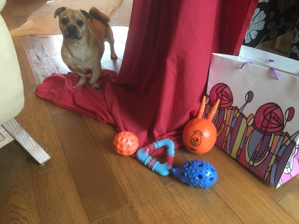
I selected some brightly coloured objects which were our dog’s toys and I placed them next to some red drapery alongside a brightly coloured Rennie Mackintosh patterned gift bag. I enjoyed the repeating rhythm of the shapes of the dogs toys in comparison to the angles of the drapery and the bag.

I examined the potential of cropping in as I felt the objects were a bit lost compared to the background and drapery in the image above. By doing this the objects were a more powerful focus for the image. I also used more solid colour with felt tip pens.

“Reflection : Do you feel that you managed to instill energy or life into the whole drawing, or does it run out of steam towards the edges? Now look at the work of Henri Matisse and write some notes in your log about the two artists. What are the similarities and differences between them? Which artist do you feel more affinity with? Consider making a second piece in response to Matisse’s more sophisticated use of space and pattern.”
http://www.metmuseum.org/toah/hd/mati/hd_mati.htm
I used a more solid approach with colour to inform this outcome which was inspired by Matisse.

Fig.1. ‘Still Life Lemons on a Pewter Plate’, 1929. and Fig.2. ‘Candlesticks on Green Table’, 1963, Elizabeth Blackadder
This piece is on display at The Art Institute Chicago, where their website has the following blurb:
” Beginning in 1917, Henri Matisse spent most winters in the southern French city of Nice. The warm light there transformed the artist’s work profoundly, leading him to comment: “If I had painted in the north … my painting would have been different. There would have been browns, grays, shadings of color through perspective.” Painted during one of his sojourns to Nice, this picture’s challenging spatial construction, palpable paint texture, and patterned background recall the still lifes of Paul Cézanne. The artist was especially on Matisse’s mind when he began this composition in 1926: the same year, Matisse’s dealer staged a posthumous retrospective of over 50 of Cézanne’s major works.”

Comparing Matisse’s work with this piece by Elizabeth Blackadder’s, I will firstly discuss the similarities and then the differences between the works.
Fig.2. ‘Candlesticks on Green Table’,1963,

The National Galleries of Scotland’s website has the following blurb about the artist:
” Painter and printmaker Elizabeth Blackadder was born in Falkirk. She studied at Edinburgh College of Art under William Gillies, and lectured at the college from 1962 until her retirement in 1986. In 1956 she married fellow artist John Houston. Blackadder is well known for her delicate paintings of flowers and still life subjects, however, she has also painted landscapes and portraits. She paints with both oils and watercolour, but uses the latter most frequently as it is well suited to conveying her sensitive brushwork. Regular trips abroad, particularly to Japan, helped stimulate her interest in colour and pattern. “
Both works are Still Life’s and both have the subject sitting on a table which forms a vertical plane taking up the bottom third of the composition, the rest of the composition features space. The title subject in both paintings are relatively small in scale. Blackadder uses cold colours, blues, greens and earthy browns which provide a contrast to the brightly patterned rug on the floor, however the earthy palette colours tend to dissipate the brightness of this pattern. The way the objects in Blackadder’s composition are flat is very reminiscent of the way pressed flowers would be collected, and this probably was an influence for Blackadder as this was a hobby in her youth. Matisse uses colours that reflect the climate, I would suggest that Nice is a lot brighter and warmer than Scotland, and the colours in Matisse’s palette certainly reflect this with his glorious red and white patterned background which meets a pink tablecloth (coincidence that red and white make pink?), and the wonderfully painted pewter plate with lovely reflections and highlights and elipses which suggest a higher standard of draftsmanship than Blackadder. I find myself favouring Matisse’s work here and I am inspired to use some of these techniques in my own works. – see Matisse inspired Still Life with Dog’s Toys.
Source Images
Fig.1. Henri Matisse,1929, ‘Lemons on a Pewter Plate’,’oil on canvas 21 x 26″, Institute of Art, Chicago, https://www.google.com/url?sa=i&source=images&cd=&ved=2ahUKEwiIuOyxpu_jAhUGAmMBHd7zDHQQjRx6BAgBEAQ&url=https%3A%2F%2Fwww.artic.edu%2Fartworks%2F153703%2Flemons-on-a-pewter-plate&psig=AOvVaw1OCbyF5g8AUav0O0BZkmTz&ust=1565217146294363 Accessed August 2019.
Fig.2. Elizabeth. V. Blackadder, 1963, ‘Candlesticks on Green Table’, https://artuk.org/discover/artworks/candlesticks-on-green-table-214446 Accessed August 2019.
The Art Institute Chicago, https://www.artic.edu/artworks/153703/lemons-on-a-pewter-plate Accessed August 2019.
The National Galleries of Scotland https://www.nationalgalleries.org/art-and-artists/artists/elizabeth-blackadder Accessed August 2019.
Project 3 : Changing the scale
“Aim : The focus of the project is to explore notions of scale and experiment with an extreme change of scale to achieve a powerful drawing which suggests monumental landscape or architecture. Before you start work, spend some time thinking about the implications of manipulating scale in drawing composition, for example scaling up a particular feature of a landscape, still life, or even a portrait.”
I couldn’t resist doing another portrait of our son, but for the sake of this exercise I went large, A2 with charcoal. Working on this size posed a few problems as I wasn’t used to working on a face this size, also I struggled for room to be able to stand back from the work as it was progressing and I had to adjust quite a few mistakes, especially around the mouth area.

“Method : Find a handful of small objects, e.g. pebbles, shells, buttons, toys. Cluster these objects together and focus on a cropped area. Experiment with using a frame for this. Make a large drawing which gives the impression of a landscape view or architectural detail, using these objects as your source material. Tiny pebbles can become enormous rocks, shells can become cliffs and sea caves. A broccoli floret can become a tree. Two pieces of lego can become a skyscraper. Or you can leave the objects ambiguous. By cropping your subject you’ll ensure that the whole composition has power and energy.”
“Reflection : This project further demonstrates the potential of composition and your own role in the process of constructing or working with a subject. Do you feel differently now about selecting subject matter and developing composition?”
Project 4 : The human form
“Aim : Drawing the human figure allows you to develop skills in observing underlying structure – the ‘engineering’ of the figure – combined with the natural grace and flow of an organic form. The effects of the way weight is distributed and light falls to reveal volume are hard to pin down but hard to fudge; figure drawing is like a workout for the eyes. By drawing parts of the figure, you can develop your skills in managing several inter-related elements within a drawing – rhythm, weight, volume, structure. The object of this exercise is to create a drawing which leads the eye of the viewer into overlapping twists and turns of the limbs. Use your judgement to make the most powerful statement you can.”
“Method : Make a drawing of two combined body parts. This might be two feet crossed over, folded arms or a hand resting on a waist. Look at the curves and the rhythms set up by those curves. Look at the muscles and bones under the skin and the tension and energy they give. Make a drawing which has a curving or sinuous composition using parts of the human figure. If necessary, consider lighting the limbs with an anglepoise lamp or similar to give yourself more dramatic tones in the manner of chiaroscuro. Don’t leave the limbs to taper off into nothing, even if that means cropping. Don’t be more tentative because you’re working from the figure. Redraw and correct vigorously to achieve the most accurate drawing you can.“
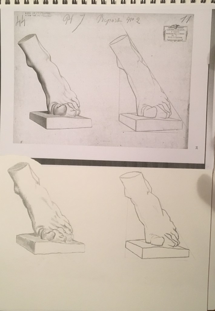
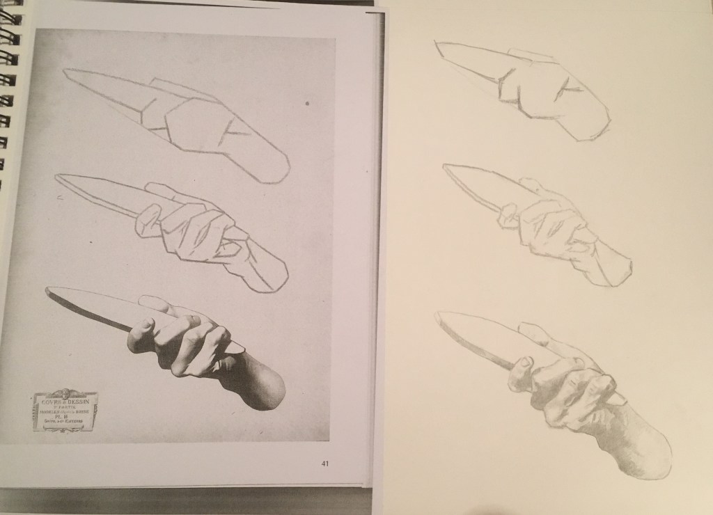
In order to continue to improve my own observation and drawing skills, I have followed the Charles Bargue Drawing Course which helps to improve your understanding of the shapes of the human body by copying from classical sculptures and drawings. My intention is to combine the taste of antiquity along with improved observational and drawing skills to help to produce a better informed outcome.
Here are some of the practice plates, I simply photocopied the plate image from the book and stuck this onto half the page of my A3 sketchbook, leaving me an equal space of blank paper to make sight size comparisons with.


Project Four Final Outcome. (above).
“Reflection : How far does your drawing direct the viewers gaze? Did you manage to retain the tension in the limbs – or do they seem a bit floppy and directionless? Have you managed to add an extra dimension to what could otherwise be a technical or academic exercise?”
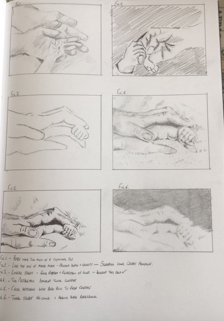
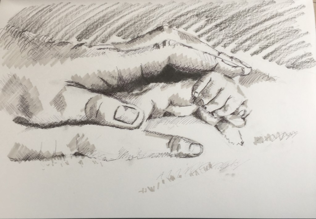
I took the observational and drawing skill directly from an Academic drawing course (Ackerman, ), and used this alongside an influence from the drawings of John Singer Sargent (Fairbrother,1983) where there is a sense of energy in his portrait drawings which is also underpinned with Academic knowledge as he was trained in Florence. I thought about the most important relationship in my life and that is between me and my family, and I like the idea of the bond between parent and child so I examined the two hand shapes and looked at using chiaroscuro to provide depth and charcoal as a medium for the energy. While charcoal would be used for an Academic study, I wanted my handling to reflect the portrait style of Sargent to prevent it from looking like an Academic study. This is an important discussion in the early chapters of Speed (1917). I also built on the idea of layers as discussed by William Kentridge in his charcoal drawings for his animated pieces and also the way Prunella Clough uses layers in her oil painting and Lithograph works.
With my study I wanted the viewers gaze to be drawn to the hands and therefore I concentrated on the contrast between the darkest dark and lightest light provided by the shadow between the male and female hand. Through practising different ideas in the sketchbook I was able to find methods to add movement and provide a sense of depth and tone with using multi media and different techniques such as cross hatching with ink.
Sources.
Ackerman, Gerald M., Parrish, Graydon, 2003, ‘Charles Bargue with the collaboration of Jean -Leon Gerome Drawing Course’, ACR Edition Internationale, Paris.
Fairbrother, Trevor J., 1983, ‘Sargent Portrait Drawings 42 Works by John Singer Sargent’, Dover Publications, New York.
Speed,Harold, 1917, ‘The Practice and Science of Drawing’, Seeley, Service and Co. Ltd, London.
Contextual focus point : Prunella Clough Tate Archive
“The Tate has been bequeathed the Prunella Clough archive and has made some of it available on the internet. Prunella Clough began her artistic career in 1937 and, apart from a brief gap during the war, continued working until her death in 1999. She won the prestigious Jerwood prize for drawing just months before her death. Prunella Clough lived a full creative life and the subtleties and sheer celebratory joy in the way she used everyday objects in her compositions is inspirational. Look at her painting entitled Wire Tangle (at the start of Part One). Note how she developed her original visual source material into a sophisticated painting. Changing the scale and making decisions about the composition to create an image that is much more than a simple natural still life.
http://www.tate.org.uk/art/artists/prunella-clough-921
Prunella Clough was a very private person. There are two fairly recent books about her, one written by Ben Tufnell, Margaret Garlake and Patrick Heron in 2007 and one published more recently by Frances Spalding in 2012.”
Looking at Prunella Clough’s work gave me the inspiration to push my own work in a different direction. Normally I am more representational in the way I draw and I am inspired by traditional techniques and compositions, but with reading about the methods of William Kentridge (Kentridge/Morris,2014) and looking at the multiple layers involved in some of Clough’s later oil paintings, I am keen to do something different. The following observations on two of her works should better inform the way she has influenced my own art for this assignment.
Fig.1. ‘Cranes’ 1952.
Prunella Clough was noted for her ability to find beautiful composition in everyday items, particularly with industrial scenes. This was notable during the fifties and sixties as this was a generally male stronghold area. Her industrial and lorry works struck a chord with my own choice of work in project 1 where my unassuming Still Life topic was in an industrial yard. I admire her bold lines and patterns and the process of layering is obvious.
Fig.2. ‘False Flower’ 1993.
This technique of building things up in layers is also obvious in her later oil painting work. This example appears to show a process of stencilling and painting over the top and then removing stencil to reveal layer underneath. The very nature of oil painting with an indirect approach is to build the painting up in layers, starting with obvious abstract simplified forms of light and dark, then gradually refine details in subsequent layers. The example here in Fig.2. has a childlike simplicity which is very attractive.
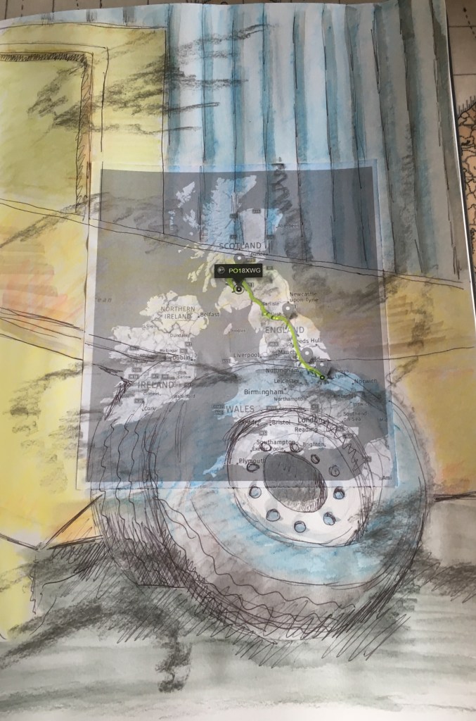
Clough’s process of taking an everyday object that most people wouldn’t give a second thought to and then working its composition to give it a vitality or interest is a valuable lesson. As I noted in my learning point in the blog, the process proves that the artist can make the subject more interesting. This is a vital point for me as I would always ignore things until they inspire me. Now I realise that I can work inspiration into the object(s). Taking this theory forwards, my own process evolved from looking at an uninspiring scene of some damaged and worn truck tyres next to a skip in a yard. I then considered the movements a truck makes which cause damage and scrubbing to tyres, showing examples of this in my blog of marks on the ground from tyres. I also considered the way technology tracks vehicle movements and took a printout from the office of one of my own night shift journeys from Spalding to Cumbernauld to Sanquhar and I combined the three by layering in different mediums and washes of colour.
This result is a big step away from my normal illustrative process, but it was enjoyable and a steep learning curve too.
(498 words).
Sources
Fig.1. ‘Cranes’, Prunella Clough, 1952, Lithograph on paper, 430 x 368mm, Tate, https://www.tate.org.uk/art/artworks/clough-cranes-p07910
Accessed August 2019.
Fig.2. ‘False Flower’, Prunella Clough, 1993, oil on canvas, 153 x 138 cm, Tate, https://images.app.goo.gl/HQnBPviXh4YK2Mtr6 Accessed August 2019.
Kentridge,William, Morris, Rosalind C.,2014, ‘That Which Is Not Drawn. William Kentridge & Rosalind C. Morris conversations’, Seagull Books, Calcutta, London, New York.
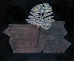
Assignment 1 Final Outcome
For the final outcome I was heavily influenced by my research and studies into the way different artists work and it has completely changed my normal approach. Previously I would work in a representational manner, so the concept of taking three different ideas that share a theme and combining them was a bit drastic for me. Having said that it did happen naturally, the process informed the outcome, each stage made me think of another development or another idea. This is a key learning point which I will take forward into other assignments.
The process of working at a composition, or cropping in on a specific part of a composition – in this case the tyres of the still life – and exploring different drawing techniques with linear and tonal mediums did help to stimulate more work. It also made me consider the subject itself and how it could be used in a different context. For me, I considered my own experience as a lorry driver of examining the marks made when a tyre scrubs the tarmac whilst being driven. I also pursued the idea that the journey the tyre goes on could make a mark by tracking technology tracing its movements within the country and having a printout made of a specific journey that I made.
This was far more than just a representational drawing of a still life subject in the academic sense which is what I used to do, I broke the subject down, considered different ways of interpreting it before considering the subjects use and this train of thought led to further ideas which I also explored and then incorporated together in the final outcome.
I have started working my way through the Charles Bargue Drawing Course as I have always been interested in the academic style of drawing with representation. I see this ability as being crucial to any style of drawing. It is a necessary platform from which to be able to better express any ideas. The figurative studies allowed me to develop this style before considering the use of more modern materials such as marker pens and looking at more abstract depictions using tonal marks.
I enjoy the process of doing the research for an assignment first as this process gets my thoughts working, it also allows me to examine other artists techniques which I might emulate. I do enjoy looking at other art for inspiration for my own.
A3 sketchbook, mixed media and montage.