Project 1 : Space, depth and volume
“Aim: A significant period of western art history has been dominated by the attempt to create a believable illusion of space and depth in two dimensions. The idea of the picture frame as a window onto a simulated vista has long been regarded as just one of many possible interesting routes but the relationship between drawings on surfaces and drawings of surfaces is absolutely vital and many artists make use of that interplay.
The description of space, depth and volume relies on depicting the way in which light operates on objects and the change in tonality that this produces. In the pitch dark, we see nothing. Natural light tends to fall on an object from one side and the sense that we make of the shadow it casts is how we judge three dimensions. the human mind is sophisticated at reading tone, which makes it hard for an aspiring artist to create a convincing visual illusion – the viewer is not easily fooled.
The first step for any student is to correct any over-reliance on outline. What we translate as an outline is actually just the moment that something disappears from view – either because something has come in front of it or because its surface has changed direction and slipped from view to reveal what is behind. Either way, being able to sit the two planes next to each other without ringing one of them with a black outline will immediately give a sense of volume and space. An outline pulls us back to the picture plane. This is not a problem in itself but, as is so often used by students, use this project to try not doing it.”
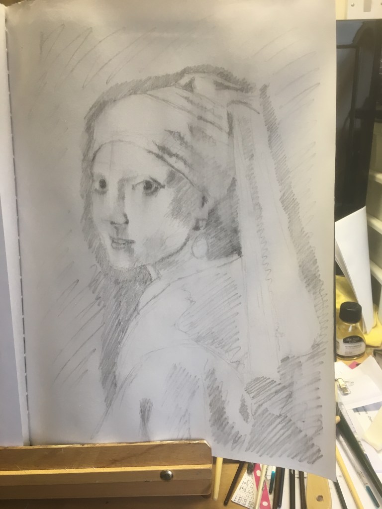
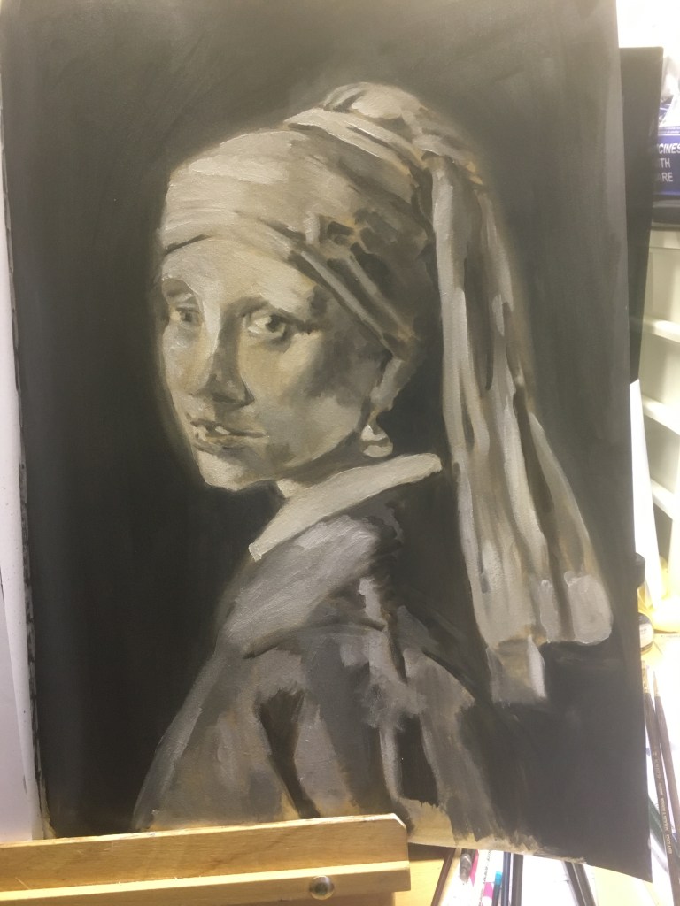
The process of this exercise reminds me very much of the preparation for an oil painting from preparing a thinned down layer of paint on top of a gessoed surface to create a mid tone to better judge your tonal values from and obey the ‘fat over lean’ rule with the oil content of each layer of oil paint as you gradually refine the detail with an indirect approach, a la prima is slightly different. Sometimes with oil painting I will prepare a ‘grissaille’ underpainting to help me to identify tonal values (see also ‘Munsell’ grey scale chart) which then informs the colour from a monochrome study. See example below of annotation copy of ‘Vermeer’s Girl With a Pearl Earring’


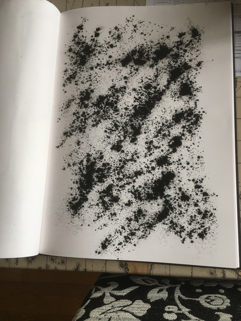
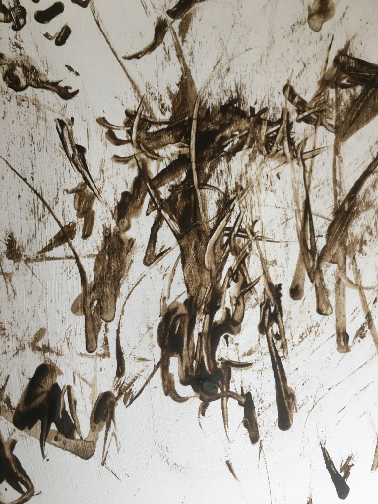
Taking my knowledge from the above process I prepared a page in my A3 sketchbook with powdered charcoal (from sanding vine charcoal sticks to a fine point for drawing with see image below).


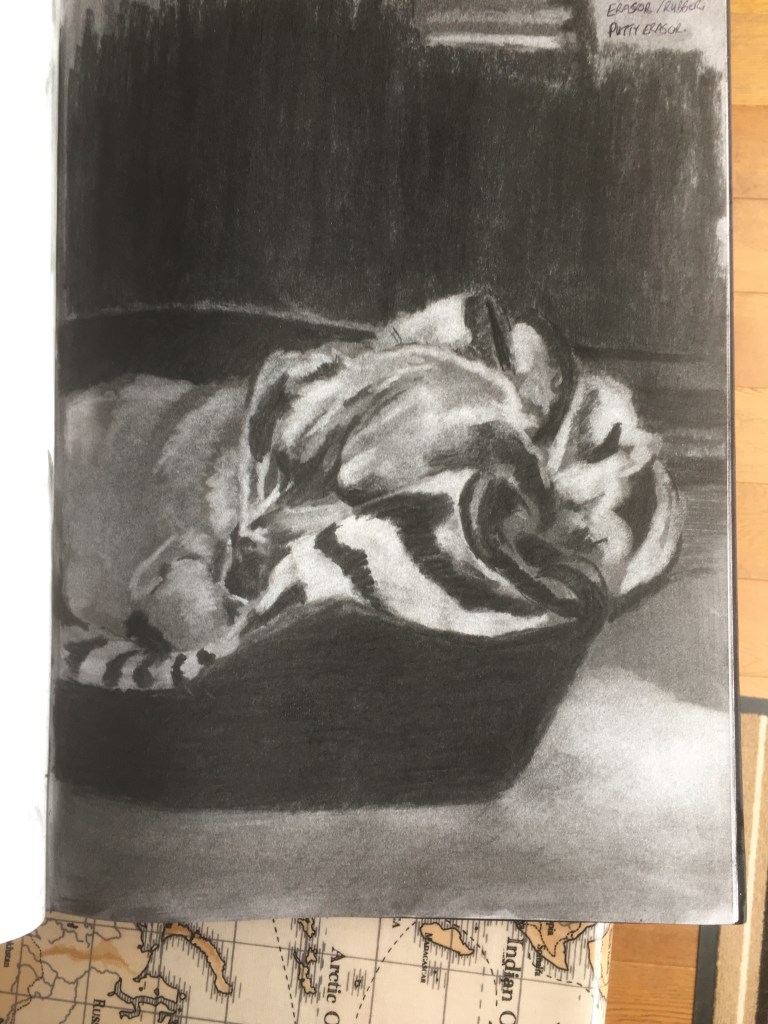
Whilst this study only took an hour and a half to complete, it is a very fast method to cover the page, I feel that this drawing is perhaps a bit too tight, I will try again with a different subject to achieve a softer feel with more atmosphere, perhaps a marble bust or a landscape would be a better choice. I can see how this method has been used by William Kentridge for animation purposes as the medium lends itself to addition and subtraction.
Tried a few self portraits with this method but using more dramatic chiaroscuro having been influenced by Vermeer’s ‘Girl With a Pearl Earring’ (see above annotation process) and also currently reading ‘Caravaggio: A life sacred and profane’ by Andrew Graham Dixon . When I have done self-portraits in the past they always took a long time, these ones were quick, probably due to the method of quickly identifying lights to work out tonal values, the darks are already there before starting, and again I feel comfortable and confident with this method as it reminds me of my oil painting process.


I can clearly see how these portraits could be built up and refined a bit more, but also that there is an immediate sense of drama (which is the aim I had in mind) from the strong light and dark. The dark background instantly provides depth, might be worth changing the tone in part of the background against the side of shadow of the face.

Reflection point – I became aware that I was relying less on lines to inform the drawing (see also the Caravaggio copy of ‘Supper at Emmaus’ 1601-2 in my A5 sketchbook to inform this process), it quickly became a tonal study and I believe the soft blurry edges help to depict form, it allows the viewer to make judgements, fill in the gaps as it were due to lost edges.

KEY LEARNING OUTCOME
Using the charcoal in a subtractive fashion was a new method for me, inspired by William Kentridge, but also Caravaggio’s ‘lightening effect’ with chiaroscuro. I considered the oil painting technique of going from darks to lights as a process and allowed this to inform my experimentation with the charcoal and lifting with an eraser.
This type of work produced some moody self portraits – which I later developed on the cover of my sketchbook with oil paints – which my peers in Drawing 2 critiqued as part of an ongoing self-help group that meet up fortnightly. They all liked this piece but for different reasons which was pleasantly surprising.
This type of drawing is not as challenging to me as an academic study of a plaster cast, but it does contain more emotion and it creates a more emotional response from the viewer. The use of dark tones and strong highlights creates a different emotional response from more subtle gradations of tone to depict form when drawing. This is an interesting point that I will consider in the parallel project of self-portraiture and connecting emotionally with the sitter and conveying my own emotional state as an artist. (Van Gogh/ Auerbach vs. Rembrandt).
Research Point
The artists below all make work which both creates and denies three dimensions at the same time. Take a look at their websites then make notes in your learning log about these artists, your response to their work and how their work relates to what you’ve been attempting in this project.
Angela Eames: http://www.angelaeames.com/
Michael Borremans: http://www.zeno-x.com/artists/michael_borremans.htm
Jim Shaw: http://www.simonleegallery.com/Artists/Jim_Shaw/Selected_Works
Aim:
Neil Cramond
Student 515702
Drawing 2
Part 2 Material Properties
Research Point
“The artists below all make work which both creates and denies three dimensions at the same time. Take a look at their websites then make notes in your learning log about these artists, your response to their work and how their work relates to what you’ve been attempting in this project.”
Angela Eames: http://www.angelaeames.com
Michael Borremans: http://www.zeno-x.com/artists/michael_borremans.html
Jim Shaw: http://www.simonleegallery.com/Artist/Jim_Shaw/Selected_Works
The first point to note is that all three artists work in very different styles. I will look at each artist individually and comment upon examples of their work on how I respond to it as well as how the work creates and or denies three dimensions, and how I see it relating to my own practice in this project.
Angela Eames is a practicing artist who lives in East Sussex, England, and has a strong academic background from lecturing both MA and BA courses in Drawing. Her own terminology about her work is being concerned with ‘spit’ she defines this as “something to do with residue or evidence left behind during and after drawing or doing – something to do with mess.” This suggests that the artist is always searching for an elusive part of her own work, that the outcome is not clear from the start. This is a bit unfair to say because her practice is to explore different avenues and exhaust different outcomes based on a theme, the idea that doing work leads to inspiration for more work. An example of this can be seen in her ‘Gameplay’ series in her portfolio of her website. See Fig 1. And Fig 2. Below. Where she has used charcoal as a medium and explored different mark making with cross hatching to create different tones. This medium produces a monochromatic effect which is disrupted by the strong solid straight lines of the red which intersect the different shapes of tones and line created by the charcoal.
Fig.1. Gameplay – Rupture#2

Fig.2. Gameplay – Unbound#2

I took inspiration from this work when doing the subtractive drawing exercise of ‘Sleeping Dog’ and for the self portraits with strong chiaroscuro. I did notice that much of her work appears to be theme based and she continues to work different examples of the same subject, the idea that art leads to art. In this instance I am thinking of the bicycle wheel images with different ellipses, bent spokes etc, all of which appear in an empty void with no other objects to provide scale or depth. I found myself engaging directly with the subject itself without any distractions, allowing me to appreciate the subtle changes she made to each version. I was interested to note that much of Angela’s work appears to float in its own space, not tied down to other objects and in the examples of Gameplay above, she uses perspective to defy our sense of space with the red tube where it is going into the distance, yet it should be coming towards us, an artistic trompe l’oeil effect. She also appears to embrace technology by using non traditional methods, the wheels and spokes I mentioned earlier appear to be computer generated and I can see how this could be beneficial where your process is to exhaust a number of ideas on one theme and not lose time on drawing over and over again. From my own perspective, the process of drawing helps me to better understand the subject, it is also an integral part of my relationship between the subject and the viewer ( which I am not a part of at the end, but the viewer engages with the result of my interaction with the subject). If, by drawing the subject, I understand it better, this will help to inform my outcome at the end.
When looking at the work of Belgian artist Michael Borremans, I am instantly attracted to his style of portraiture which is heavily influenced by 18th Century art. He uses shadows to give his figures a sense of placement, perhaps next to a wall, but without defining the wall so the viewer is left to figure out these details. He even creates figures that are impossible with their relationship to their own space. By saying that I mean that he creates a painting of a figure in a gloomy space so our eyes initially see a figure in the corner of a room with her back to us, but closer inspection reveals that the figure is not correct in its environment, the legs are missing from the thighs down, it is floating in space – another trompe l’oeil. The specific example is Fig 3. – ‘Automat (1)’, 2008 80 x 60 cm, oil on canvas.
Fig.3.

He also uses brushwork and degree of finish (or not) in order to produce contrasts in the work which will attract the viewers eye within the painting. This always makes a painting more appealing than a photograph as the viewers eye searches for these differences and engages more with the subject – see ‘Mombakkes 1’ in Fig 4. below. This is an aspect of painting and drawing that has always fascinated me and is something I am exploring with the differences between line and tone in the work in the Parallel Project. Some of his marks are loose and expressive, whilst others are tight and refined. The human eye enjoys finding these differences. His use of perceived space was also intriguing, the floating figure above for example, we only know she is facing a wall because there is the indication of a solid surface below her skirt where her legs should be which has the perspective of a floor going into the corner of a room which she is facing – the ‘floor’ surface is at opposing diagonals tapering upwards either side of her. The ‘Walls’ are darkness leaving the viewers eye and brain to think of the space as a wall, this darkness meets the subject’s dark hair where lost edges make us imagine the shape of her head. I found myself engaging for a while with this painting precisely because of those techniques of using space and surroundings to give the subject a context, even although the context might not make sense. I found this inspirational when doing the chiaroscuro self-portraits using charcoal and a subtractive approach.
Fig.4.

The American artist Jim Shaw takes inspiration from American culture, comic books, posters, and found artworks and then adds his own creative spin from his imagination and is known for having a layering technique. He also uses his own work as a source of inspiration to produce more work, the most famous example being his current ‘Oism’ project (see Fig.6.below). This process of developing work from work shows that an idea can evolve and grow. For my own work, one idea that I developed was the self portrait with a load of cropped images of myself stuck down to provide a range of tones, this was inspired by Jim Shaw’s use of overlapping drawings on one piece – see example ‘Untitled’ 2017 in Fig.5. below
Fig.5.
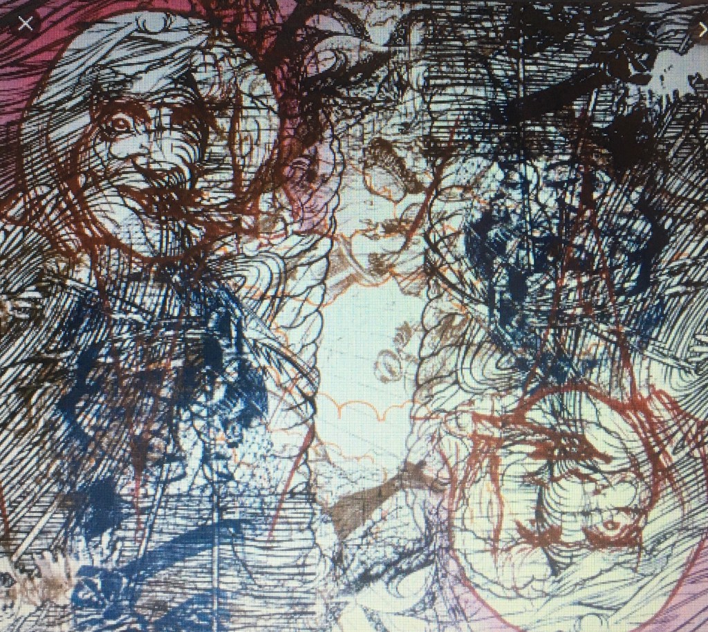
Fig.6.

The artist uses a broad range of materials such as oils, acrylics, graphite, sculpture with which to produce his work, all of which produce different results. In this way he is not pigeon-holed into one specific medium, he keeps his work fresh and people guessing about his work. While this experimentation might help artistic creativity, it runs the risk that people will never get to recognise your own individual style. This is by no means a criticism, merely a personal observation. With my own work, I will continue to experiment with mediums in order to find my own voice for artistic expression.
The layering technique of work on top of work leads to a confusion of depth and space within the works as the lines intermingle with each other to inform one outcome.
Sources
Fig.1. Angela Eames, Gameplay, Rupture#2, Archival print on paper 30” x 30” , https://static.wixstatic.com/media/2e084b_b41cd070141842609c9cd498132969f5~mv2.jpg/v1/fill/w_381,h_381,al_c,q_90,usm_0.66_1.00_0.01/2e084b_b41cd070141842609c9cd498132969f5~mv2.webp Accessed 6th September 2019.
Fig.2. Angela Eames, Gameplay, Unbound#2, Archival print on paper 30” x 30”, https://static.wixstatic.com/media/2e084b_fb91e2bc0d0441239a1d5c59682c662c~mv2.jpg/v1/fill/w_381,h_381,al_c,q_90,usm_0.66_1.00_0.01/2e084b_fb91e2bc0d0441239a1d5c59682c662c~mv2.webp Accessed 6th September 2019.
Fig.3. Michael Borremans, Automat (1), 2008, 80 x 60 cm, oil on canvas, https://modernartnotespodcast.files.wordpress.com/2015/03/michac3abl-borremans_automat-902.jpg Accessed 6th September 2019.
Fig.4. Michael Borremans, Mombakkes 1, 2007, 56.5 x 44.5 cm, oil on canvas, https://www.google.co.uk/url?sa=i&source=images&cd=&ved=2ahUKEwim-Y-I8vrkAhWExoUKHd57CJkQjRx6BAgBEAQ&url=https%3A%2F%2Fartmap.com%2Fhara%2Fexhibition%2Fmichael-borremans-2014&psig=AOvVaw0FJScLzb6fKADIfvO-ZrAY&ust=1570013448288472 Accessed 6th September 2019.
Fig.5. Jim Shaw, Untitled, 2017, 121.9 x 137.2 cm, acrylic on wood panel, https://www.google.co.uk/url?sa=i&source=images&cd=&ved=2ahUKEwiI1a6K-frkAhURtRoKHWgiBb8QjRx6BAgBEAQ&url=https%3A%2F%2Fwww.simonleegallery.com%2Fartists%2F38-jim-shaw%2Fworks%2F7769%2F&psig=AOvVaw38X5Hmi7V4D-LEO3jBNP-H&ust=1570015337037779 Accessed 6th September 2019.
Fig.6. Jim Shaw, Dream object – Oism student art Tornado, oil and acrylic screenprint ink on canvas, 61 x 61 cm, https://www.google.co.uk/url?sa=i&source=images&cd=&ved=2ahUKEwjzrJCS_frkAhV0AmMBHV5bDNoQjRx6BAgBEAQ&url=http%3A%2F%2Fwww.artnet.com%2Fartists%2Fjim-shaw%2Fdream-object-oism-student-art-tornado-qfA-5Tn-BQNytmZ-arsmXg2&psig=AOvVaw2FOYIU9pgJeQv_Vp77VOSN&ust=1570016433952520 Accessed 6th September 2019.
Project 2: Mark-making materials
Aim: When you think of a drawing, what’s the first thing that comes into your mind? We might initially think of pencils and maybe a Renaissance masterpiece. In fact pencils are quite a modern invention and most Renaissance drawings were done with a stick of silver and a pot of ink.Your sketchbook should be filling up with drawings in a variety of media by now, but for this project you’ll extend that exploration even further.“
“Method: Build up a variety of surfaces using whatever comes to hand that has two differently coloured layers. Make several drawings by scratching through the second layer. You can use wax and acrylic paint, oil glazes on board, household paint on wood, varnish on metal. Vary the scale of the drawings depending on your support. Choose a subject from your sketchbook or learning log and push through to make complete drawings, not just squares of texture with random marks. That way you’ll really learn what the materials can do.”


Project 3: Narrative
“Aim: Materials and the way they are applied can be very expressive and can imply a narrative without using words. Thickly plastered encaustic or finely dusted chalk – each imparts information about itself and, through association, the subject or your response to it. Take time to experiment with the expressive potential of a range of materials and then make a selection to create a piece where the materials contribute significantly to the way the piece is read.”
Somehow I really struggle to get to grips with exercises like this one, its probably down to my dyslexic brain processing what is required and a mass of possibilities will get bottlenecked trying to get out with the result that I begin to doubt what is actually being asked rather than breaking it down into simple steps and seeing where the process leads, I try to think about the outcome first then figure out how to get there.
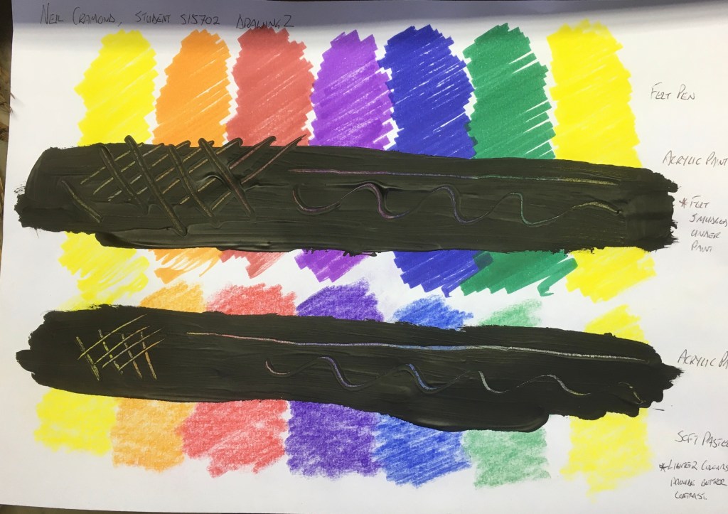
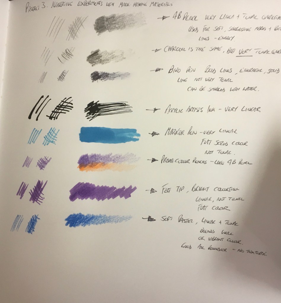
I began by selecting a range of materials and considered their linear and tonal properties to understand what mark making they would be best suited to, whether the marks would be soft and subtle like a wash, or bold and vibrant with texture or even just flat colour.
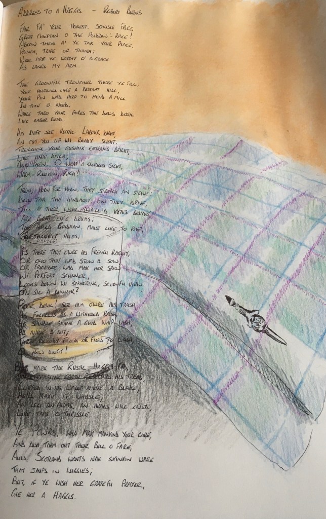
I considered a number of close family members ranging from my wife and child to cousins, but I finally settled on my father-in-law, who is no longer with us, he was a painter and decorator to trade and his main passions in life were fishing, shooting, Burns Suppers – where he often recited ‘Tam O’ Shanter’ or addressed The Haggis and was delighted to do so dressed in full Highland regalia. His was very fond of whisky as well. I wanted to incorporate one of Burns’s poems so it had to be something that had a strong linear quality to show above the tonal background. The Kilt lent itself both to vibrant materials such as oil pastel or even felt tip pen to capture the strong colours and pattern, but the poem would have been lost and I wanted it to be an equal part of the composition so the decision has to be to go with soft, tonal material, I considered pencil or pastel. Knowing that I was going to superimpose over the material with ink, the pastel would not lend itself to this process, the colour pencil was therefore a good option. They also blend pretty well which was an important consideration for the colours of the kilt. I would have liked to show these workings, but I ran out of time before assignment submission, I will discuss catching up on this work after tutor feedback.
Contextual focus point: Cornelia Parker
“Research the work of Cornelia Parker. Make notes in your own words in response to the following:
What do you think Parker is trying to do in her piece Poison and Antidote Drawing (2010)?
Poison and Antidote Drawing is created using Rattlesnake venom and black ink, anti-venom and white ink. Parker often uses bits of her subject to make her artwork. Why do you think she does this?
How do you think it feels to stand in the presence of artworks that are constructed from original objects of great cultural significance? How does that differ from, say, standing in front of a painting of the same object?”
Cornelia Parker is a British artist who is best known for her sculpture and installation art such as ‘Cold Dark Matter’, (1991). ”Born in 1956 in Cheshire….. Her work is represented in international collections and she was nominated for the Turner prize in 1997” (Downs et al, 2007. P.24, examples of work p.70,71, and 72) These particular examples show the artist creating works such as ‘Explosion Drawing’, 2001 using Charcoal, sulphur, and saltpetre, and her infamous ‘pornographic Drawing’, 2005 using ink made from dissolving video tape which were confiscated by HM Customs & Excise in solvent. Her contemporaries in 1993 include Mona Hatoum, Sarah Lucas, Gillian Wearing and Rachel Whitbread, all of whom were looking back to the sixties and seventies for new Minimalist and Conceptual Art influences (Foster et al, (2004), 3rd edition p.737). Hardly surprising then to find that she also used Rattlesnake venom in Black Ink and antidote in White Ink for her Poison and Antidote Drawing series (see images below). It would appear then that the material used for the drawings are of equal importance to Parker as the process behind it. When speaking of this process for the ‘Pornographic Drawings’ she said “I’m making you look at them again but they’ve become an abstraction, an abstraction caused by my subconscious because I just dropped these blots of “ink” onto paper and folded it” – The Art Story – web page. The inference here being that this series of Drawings are ‘Rorschach drawings’ – like those used in psychoanalysis to access the subconscious and in it’s founding father Sigmund Freud’s case a lot of things are linked back to sex. But the point being that Parker has found a new use for the original object in a completely new environment. This is the artist’s aim, to make you look and think.
This thinking is what I see as being behind the ‘Poison and Antidote Drawings’ (see Fig’s 1-3 below)
Fig.1.

Fig.2.

Fig.3.

Sources.
By taking Rattlesnake venom and adding this to the Black Ink, and the Antidote to the White ink, the two substances (which are polar opposites) now add substance to the opposites of Black and White. By having the knowledge that the black contains a deadly substance, I am associating evil, harm, and even death with the dark tones in these drawings, while I consider the white to be the provider of life, healing and light. Had I not known about the venom and the antidote in the black and white, I would be considering these works purely in terms of the artist exploring tones, I would have seen Black, White, and a few shades of Grey.
In conclusion, I see Parker is using objects in a new way, making her audience see objects in a different way – as she did with ‘Cold, Dark Matter: An Exploded View’ (1991) where she blew up a shed in order to re-arrange the pieces and its contents as they were in the middle of the blast – You think you know an object, and suddenly its meaning is being challenged, this is why Parker added venom into the Black Ink, it is no longer just Black Ink, so the viewer engages on a different level with the object. It could also be that this is how the artist has to engage with her process in order to produce the outcome. I gave the example of the Pornographic Drawings coming from confiscated tapes and then making ‘Rorschach’ drawings which are associated with sex, but in a very different visual way. The artist has a relationship with the subject which is then transferred onto canvas/paper, the viewer then has their own relationship with the subject through their own interpretation of this outcome and their own reaction to the work, and this also forms a relationship between the viewer and the artist, even although the artist and viewer are separated. I mentioned earlier how my own interpretation of a piece altered because of a changed perception of what was in the ink. (Is there venom in the black ink and antidote in the white?) The perception of the knowledge changed the way I looked at her work. However the final point about work being created from culturally significant works made me think briefly about the controversy surrounding the 1998 piece ‘From Mountain Landscape’ where Parker framed and labelled canvas liners and tacking edges that originally belonged to Turner’s paintings, but were now deteriorated and submitted them as her own work, this raised an interesting question over ownership between Turner and Parker – Tate exhibition “Room for Margins” (1998). The main thoughts I have on this final matter are mixed. Part of me does feel that the artist can change the way the viewer sees an object by including or adding something to the material if that is your process to produce art, it makes it different to just medium on a canvas/paper. The other part of me also feels that the artist should be able to express their views and emotion through the act of drawing/painting/mark-making itself on the paper/canvas. As I mentioned earlier, how do we know there is venom in the ink? Is the use of narrative really necessary? Shouldn’t the artwork speak for itself purely through the artistic use of materials and artistic ability and expression alone? If I was looking at a piece of art constructed from an original object of cultural significance, I would find myself asking why it is necessary to use an object of cultural significance to convey your message and not just do it through the act of Drawing in all of its many forms as discussed by Petherbridge (2010), where she compares historical and contemporary images and the parameters between initial sketches and finished drawings where artists experiment. This is a huge area ranging from one extreme to the other, and in my opinion, there is enough room here for any expression without having to add gimmicks. I am in no way saying that artists who do this are wrong – I believe in the diversity of art and that beauty is very much in the eye of the beholder – but I do believe that a piece of art should be strong enough on its own, if the painter paints the subject with authenticity, then it will stand on its own and convey its message to the viewer without the ‘help’ of the addition of an object of cultural significance. To give a practical example. I will guarantee that anybody could walk into a museum or an art gallery with a range of work by the Old Masters or more recent artists of the eighteenth and nineteenth and twentieth centuries, there will be at least one painting, a portrait, landscape or a still life that will give the viewer a feeling of awe, it hits you in the stomach. All those artists had was a subject which they portrayed through their materials and their own skill onto the canvas that now hangs on a wall, there was no additional item(s) of cultural significance to add to their materials ( I do believe that there was a grasshopper trapped in one of Van Gogh’s thickly painted scenes of a corn field, not sure if that counts though).
Downs, Marshall,Sawdon, selby, Tormey, 2007, ‘Drawing Now – Between the lines of Contemporary Art’, Tracey, I.B. Taurus & Co Ltd, London, New York.
Foster,H, Krauss,R, Bois, Yve-Alain, Buchloh, Benjamin H.D., 2004, ‘Art since 1900’, Thames and Hudson Ltd, London
Petherbridge, Deanna, 2010, ‘The Primacy of Drawing – Histories and Theories of Practice’, Yale University Press, New Haven and London.
The Art Story, web page, https://www.theartstory.org/artist/parker-cornelia/ accessed 28th September 2019.
Fig.1. Parker, Cornelia, Poison and Antidote Drawing (8), 2012, 22” x 22”, Wilde Gallery, Geneva Switzerland, https://www.artsy.net/artwork/cornelia-parker-poison-and-antidote-drawings-8 Accessed 28th September 2019.
Fig.2. Parker, Cornelia, Poison and Antidote Drawing, 2009, 6” x 4”, Artnet, http://www.artnet.com/artists/cornelia-parker/poison-and-antidote-drawing-T0ze1YuCN1w2XGmmHPfE5A2 Accessed 28th September 2019.
Fig.3. Parker, Cornelia, Poison and Antidote Drawing, 2010, 14.6” x 14.6”, Artnet, http://www.artnet.com/artists/cornelia-parker/poison-and-antidote-drawing-ZI7yQWsUJGtv6_ZFa8FIAA2 Accessed 28th September 2019.
“Method: Think of a person for whom you have strong feelings or hold a strong opinion. Find an object or item of clothing that reminds you of that person. Make a piece of artwork that uses the object to provide the imagery but uses the materials to give the viewer a sense of the person. In effect, you’re making a portrait of a person as an item of clothing. You could use your daughter’s first shoes, your mother’s hat. Thinking more widely, you could use a blue tooth device and tie to make a piece of work about bankers or an old school tie wrapped around a silver spoon for our political class. Experiment widely and produce as many pieces as you need to until you arrive at something which you think fits.”
“Reflection: Now reflect further on the potential of these ideas. For example, what effects could you create by juxtaposing apparently incongruous materials and subject? Imagine an enormous violently applied drawing, engine oil on sheet steel, of a newborn baby. How would that read?”
Assignment Two
“Make a Drawing of a subject of your choice using the subject itself, or tools constructed from the subject, dipped in ink or paint.
Here are some possible solutions to this brief to start you thinking:
Collect a variety of branches and seed heads from a garden or woods. Construct a still life with the majority of your collection but tie small amounts of the remainder to sticks or the wrong end of brushes to make implements that you can dip into paint or ink.
Take some pots of ink or paint to the beach and make a drawing using shells and driftwood as applicators.
Make a drawing of used cars at a scrapyard using bolts and bits of car as applicators.
This project will allow you to consider the nature of your subject and to make a drawing which makes use of its physical properties in a very direct way.“
Assignment 2 Final Outcome
Pheasant drawn with a Pheasant Tail feather (quill and feather fibres). A3 acrylic paint on gesso.

Learning Outcome.

I particularly enjoyed the use of the Pheasant Tail feather as the point of the quill provided a nice scratchy texture at the same time as it was applying a little bit of paint – I did not cut a nib into the quill to enable the paint to flow. My earlier experiment with putting texture into gesso before applying ink led me to apply a coat of gesso on the paper and draw ‘wet into wet’ with the acrylic paint so the tip of the quill was digging in and creating an extra texture on the surface. The very nature of the short application really helped to focus my attention on the marks I was making, so the use of the Pheasant Tail made me think about the Pheasant I was drawing, what direction are the markings going in, how dark is this bit, do I need to add water? By lightly brushing over the thicker splodges of paint with the feather fibres, I could drag some paint in fine marks which was a nice contrast to the thicker applications from the quill. I was also inspired by Rembrandt, namely his drawing around 1654 of ‘A Young Woman Sleeping’ which was created with a brush and brown wash but just look at the economy of his marks, they are so suggestive yet accurate at the same time. ( See image below).
Petherbridge (2010), discusses the experimental use of materials as being essential for the true artist not to pigeon hole yourself into only believing that certain materials can only do certain jobs – ‘The Primacy of Drawing – Histories and Theories of Practice’ 3rd printing p.120-121 ‘The Contingency of Materials’ – “ Historical writers of treatises in the West have been very specific about which materials should be used for which kinds of drawings, and academies have similarly earmarked particular drawing materials for canonical purposes at certain times, only for them to be refuted a few generations later……. An insistence on learning about materials, processes and techniques is probably what demarcates amateur artists from professionals.” In this respect I am guilty of not experimenting enough purely because I love traditional techniques and am keen to learn more about those particular aspects. This is not to say that I rule out experimentation, absolutely not. I thoroughly enjoyed this process and I hope to expand on this learning curve.
Image 1.


I enjoyed the process and found that by being a bit more care free and not so precious about drawing exact marks, I could still achieve a recognisable outcome of a Pheasant, I was trying to create some movement and energy around the thrashy grass, I cant help but wonder if a light wash in the background towards the tree would have helped to provide more sense of place and depth for the image, but the point of the assignment was not about atmospheric perspective.
I can definitely see the benefit in this process as I found myself engaging more with the drawing process purely because I was having to think more about how to use the drawing tool to replicate my subject. Using my experimentation in earlier exercises came in useful – the application of a layer of gesso on the paper as a base to scratch into to create the texture of feathers and grass came from the idea about using this technique to create the grain of wood, so an altogether different application, but the method was the same.
I found myself relying less on my drawing ability – although it should always come into play – and more on the processes of material experimentation and technique for this final outcome.
Image source. Rembrandt, ‘A Young Woman Sleeping’ circa 1654, 246 x 203 mm, London, The British Museum, https://www.google.com/url?sa=i&source=images&cd=&ved=2ahUKEwjJ0JHGmrflAhUNmRoKHZQoDeQQjRx6BAgBEAQ&url=https%3A%2F%2Fwww.google.com%2Fculturalinstitute%2Fbeta%2Fasset%2Frembrandt-van-rijn-young-woman-sleeping-a-drawing%2FRgGYBoljD5rVJg&psig=AOvVaw0Ysvz_bvoUoQp4Hkqb9uJf&ust=1572085915589507 accessed October 2019.
Petherbridge, Deanna, 2010, ‘The Primacy of Drawing – Histories and Theories of Practice’, Yale University Press, New Haven and London.
KEY LEARNING POINTS
I moved away from the use of traditional materials to draw with and used a Pheasant Tail feather to make a drawing of a Pheasant. This was inspired by Rembrandt’s ink sketch of ‘A Young Woman Sleeping’ in brown ink where I used the quill of the feather dipped in brown acrylic paint. I added water to make it thinner and lighter and used it neat for thicker, darker marks.
Building on my experience from Assignment One where I investigated the subject of a tyre, I also considered the subject of the Pheasant. This led to the use of a tail feather to make the drawing with and allowed the drawing material itself to make its own unique marks. This lack of control seemed to add a certain quality to the drawing outcome, a certain roughness that actually enhanced the subject. It’s not as far removed as Cornelia Parker’s work, but I did take something from her method of using subject material within the drawing.
500 word response to my experience of the assignment
The first project on Space, depth and volume was interesting as it involved a practical technique and the exercise helped to inform some self-portraits for my parallel project which has got me well on track for the next part. I tackled the research points quite early on and I think this was a good thing as I used to put these things off until last, but in this case the research work of looking at other artists practice gave me more of an insight into what was expected in this assignment.
I struggle to build up a variety of drawing media, I use pencil, charcoal, oil pastel, acrylic paint, and ink in a traditional manner, so experimentation with media is not really my forte. I have tried to apply some mixed media in the assignment, but it wasn’t easy. My brain tends to prefer traditional methods and tried and tested best practices with materials rather than pushing boundaries. This was apparent in the last exercise the narrative. I struggled to fully understand just what was expected and how I should go about it. I got myself confused and left it alone, preferring to push on through the Bargue Drawing Course and Parallel project where I felt I was making more progress. By the time I realised what the assignment was asking, it was too late for me to produce a collection of supporting work and experimentation of ideas.
I have always favoured classical and traditional artistic techniques over modernism and to that end the subtractive drawing techniques from Project 1 was more enjoyable, especially as I was reading about Caravaggio who is synonymous with the chiaroscuro effect. At the same moment I was pushing on with my personal project with the Charles Bargue Drawing Course and this was focussing on lines and tone – which again is informing my outcome in the parallel project of self-portraiture. The downside to this is that I took my eye off the ball with Project 3 in the assignment.
Whenever a course asks me to do activities like this one I feel like I am an Elephant being asked to climb up a tree and therefore I don’t embrace it as I should. I struggle to comprehend it, and then once I do, a whole series of thoughts all rush at once to come out of my mind but they all get bottlenecked, and nothing ends up coming out, but I know there are ideas in there. It’s infuriating to say the least. At least with the final assignment piece of the Pheasant, I felt there was a worthwhile process in the outcome.
I hope to get back on track in the meantime after tutor feedback.
(476 words)
