I began exploring the possibilities of drawing people quickly in various locations, namely family members and people in cafes. Quick gestural studies to capture the essence of the sitter were required as I was drawing from life and the subjects were not aware I was drawing them so they were not sitting still. This forced me to be quick and make portraits with minimal lines. These studies tend to be in my portable A5 sketchbook.


I quickly realised that due to my work being a nightshift pattern, I was going to struggle to meet enough people to develop my drawing ideas and process. My original idea was to just start collecting as many drawings as I could and then find something from that perhaps it would be linear, perhaps it would be tonal, perhaps it would be a particular expression in the eyes or mouth. The above quick sketches showed some obvious relationships between line and tone in a drawing.
I began to ponder over the fact that tone is made up with a series of lines either close together or cross hatching to make a dark area, and a line is just a very narrow tone. The two are inter-related and yet completely separate.
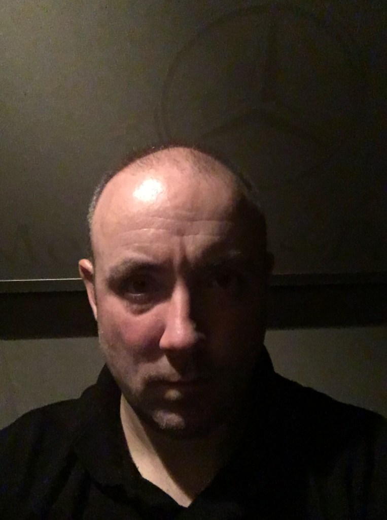
In order to explore these relationships with some drawings I would need some subjects to draw, and as I mentioned earlier this would be in short supply, however I was always available as a model, so I decided to explore self-portraiture, (an area I have always tried to avoid). However I told myself that Caravaggio often put his own self-portrait in his works, Rembrandt and Van Gogh were famous for their self-portraits too so this was a good choice.
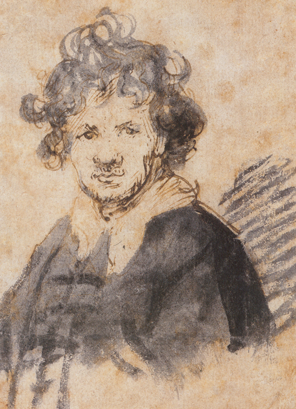
I now considered some artists from the past who worked in line and tone. For lines I first looked at Rembrandt’s etchings (I also considered Leonardo da Vinci’s wonderful drawings, but they were more detailed studies than quick gestural marks). I also looked at Van Gogh’s etchings as well for a different style.
Fig.1. Rembrandt etching.
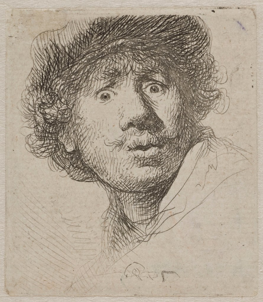


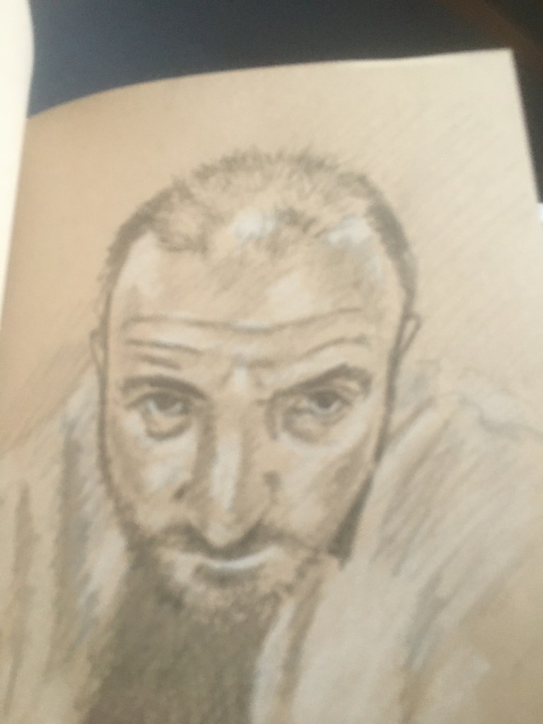
Trying to emulate Rembrandt is a daunting task, however I do feel I have succeeded in this linear study where I feel I have managed to capture an essence of expression within the lines.
Fig. 2.

With this self portrait also being inspired by Rembrandt I feel I have captured more of my spirit and the inclusion of a shadow in the background helps to provide a sense of depth and place. Trying to emulate the marks of Rembrandt’s etchings with pen and ink in my work. Despite the glum expression, I get a feeling of energy from this sketch, perhaps its the vibrancy of the lines, the short strokes, the changing direction to indicate form or a mixture of it all.

The self-portrait painting above was painted in an Alla Prima style which is vastly different to my normal preferred indirect approach of building up layers in stages.
LEARNING OUTCOME
There is a more ‘painterly’ feel to this portrait, it was immediate, the brush marks are rough, the colours are not exact, yet it does retain a likeness, an immediacy and gestural quality that no photograph could ever capture. Although this is a painting, it was completed in the same manner as a drawing could be in one sitting. There is also a back and forth process between master copies and my own sketchbooks to inform the final outcome rather than a simple direct copy.

The above study shows a series of short marks to depict tone and a variety of directional marks. Although a good gestural study, it lacks the energy of the ink drawing above.

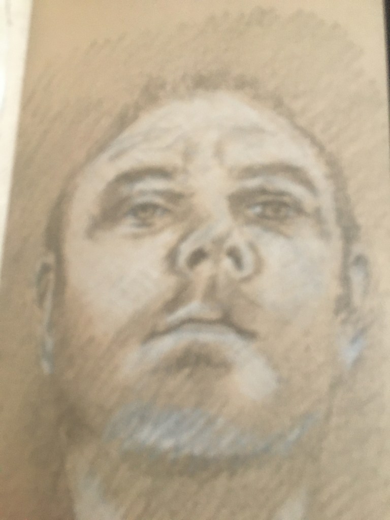
I used highlight on this portrait to see how that would effect the outcome. It certainly helps to add roundness, note the stronger bolder line on the shadow side of my face (right hand side as you view it), and lighter lines on neck and side of head on left. I think this aspect works well, technique employed by Charles Bargue Drawing Course as an essential drawing skill.

The study above uses linear effects with a bit more detail, but still retains tone Unusual drawing yourself whilst wearing sunglasses. It was difficult to judge values on toned paper whilst wearing shades. Again foreshortening of mirror has distorted my facial proportions slightly.

The above image was a quick self-portrait while I was sitting on the couch and the dog jumped up to investigate, he was fascinated by the mirror so I tried to include his expression, but he got fed up after a minute and left me to it. Energy in line due to quick nature of sketch – time critical – how long will the dog stay still? Pressure of situation has produced a good outcome.
I also considered the drawings that used brown ink and I tried using raw umber acrylic paint on a gessoed surface, one tonal study, the other linear.

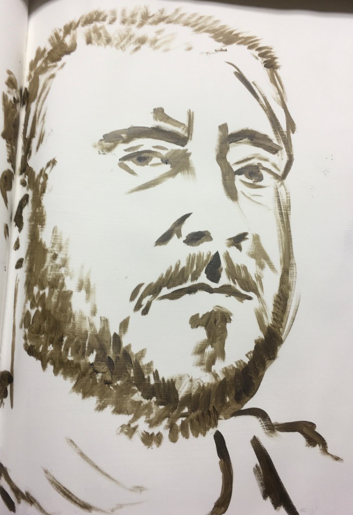
I recorded myself painting both of these as a time lapse and posted them on the OCA Drawing skills page on Facebook.
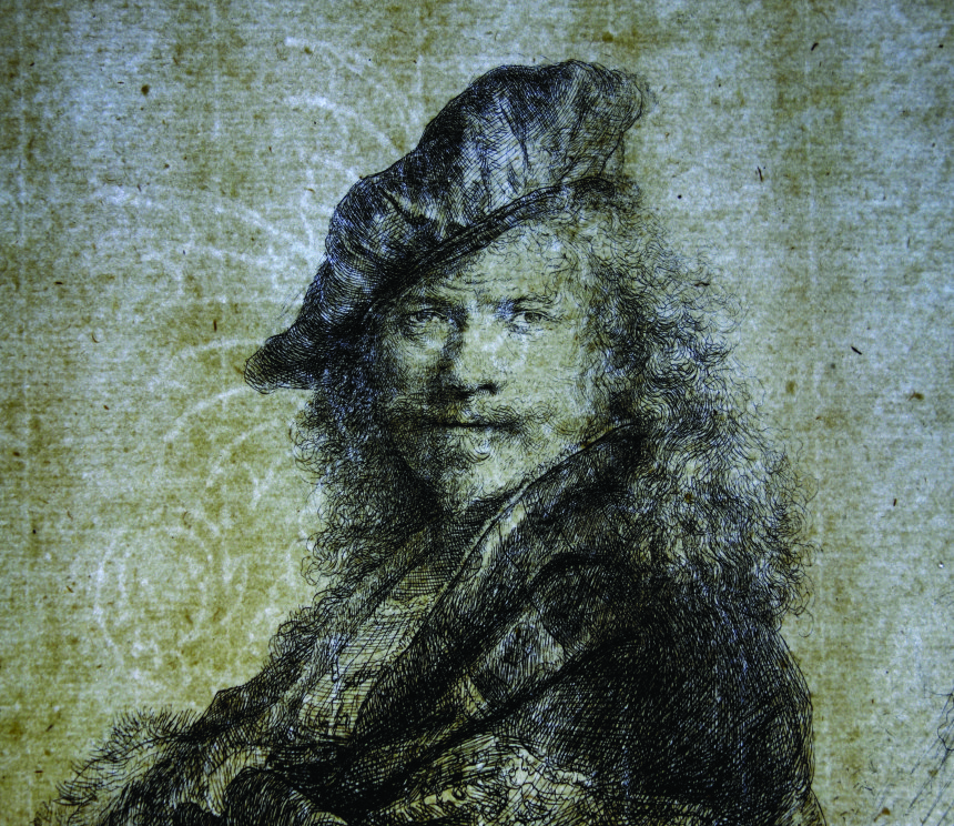
Fig. 3. Rembrandt etching, note the powerful use of chiaroscuro, probably influenced by Caravaggio’s style. Quality of both line and tone in this work.
The image below is a copy of Caravaggio’s self portrait within his final painting, ‘The Martyrdom of St Ursula’ showing the slight tonal shifts which leave the viewers eye to make sense of the shapes in the background. It is suggested through the use of tone.

Note the difference in atmosphere between the two works achieved by using either line or tone to depict a self-portrait.
Fig.4. Van Gogh’s etching of an old man uses both linear and tonal qualities, but I would say that this study is more linear than tonal.

The Van Gogh etching shows a bolder use of line and I am reminded of the painting exercise I completed. Van Gogh employs a bold outline to depict solid form, there are no blurred edges and this conveys a sense of power and emotion.

The above study of Caravaggio’s work shows the quality of line and tone in this study, but there is more emphasis on tone to produce the ‘lightning flash’ imagery with chiaroscuro. See other example below of tonal study of ‘Supper at Emmaus’ 1601.

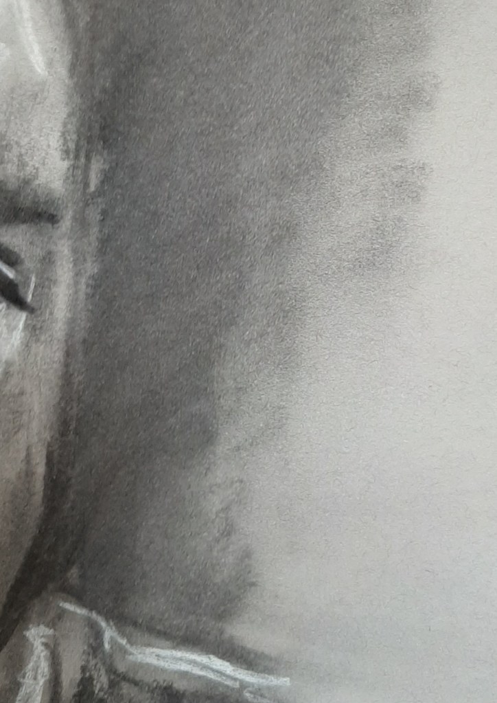
These studies were also informed by the subtractive drawing exercises in the coursework by erasing to produce layers of highlight which informed this tonal self-portrait. See Assignment 2, Space, Depth and Volume.

Learning Point – could have used more tones to create a smoother transition of form, this piece only really has three tones and a highlight, Munsell scale has nine degrees between light and dark. See example of tonal study of Caravaggio’s ‘Supper at Emmaus’ 1601 above of broader range of tones within the drawing.

The above copy was developed using a combination of tonal marks from marker pen and highlight pencil as well as the linear aspect of the biro pen to add extra shadow and depth to the toned paper where cross hatching was used

The above study shows how a good likeness can still be achieved with very little line.

The above self-portrait probably owes something to the subtractive exercise in assignment 2 as well as Caravaggio influence using both subtle and dramatic tone to create drama.

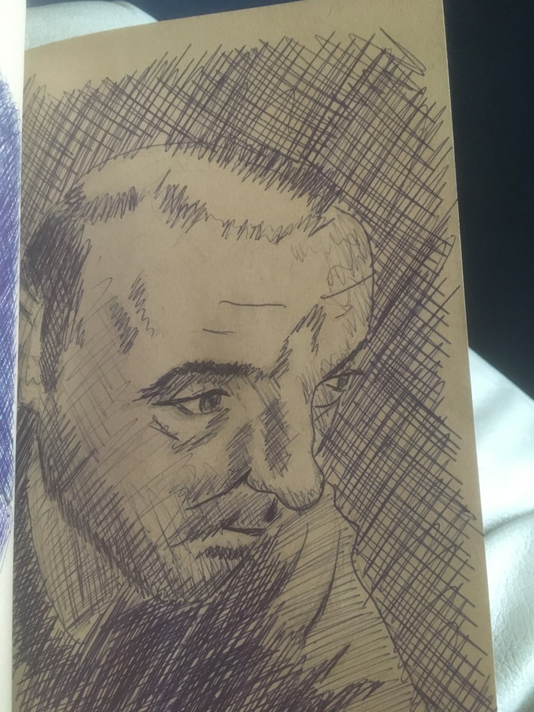
Cross hatching was the main idea in this self-portrait to produce areas of tone – an influence from Bargue Drawing Course – see main menu in blog title page. It can be an effective technique, but my drawing has let me down as lower cheeks are too round, I have foreshortened myself due to mirror being too close.

The above image I am trying to concentrate on the line itself with no tone. Look at Rembrandt’s work on the left, it is mainly tone with just a few squiggles of ink to show the facial details. There is a real economy of movement in producing this work. In my piece, I think I have achieved a good likeness without using tone, but the image does look rather flat as a result.
I began considering my own image and wondered if I could incorporate photographic images of myself within a work, kind of like Chuck Close’s work. I began by taking some images in slightly different lights to achieve different tones. (See images below).


sketchbook experiment with stuck on images. 
palette and a thick bristle brush.

I wanted to consider some self portraits from different angles. I used my A5 sketchbook with toned paper.


The linear aspect above was influenced by Van Gogh’s etching in fig.4 above

The portraits below were inspired for the research on Jim Shaw where I was attracted to the different colours and linear quality to his ‘oism’ works.
Fig.6.Jim Shaw

Fig.7.


I used the method of drawing from a distance with the sketchbook on the floor and looking down at a mirror (which created some foreshortening and a different viewpoint) with either a piece of charcoal or a biro pen tied to the end of a section of a fishing rod.
LEARNING OUTCOME
I was reminded of and inspired by Frank Auerbach’s portraits in charcoal and chalk


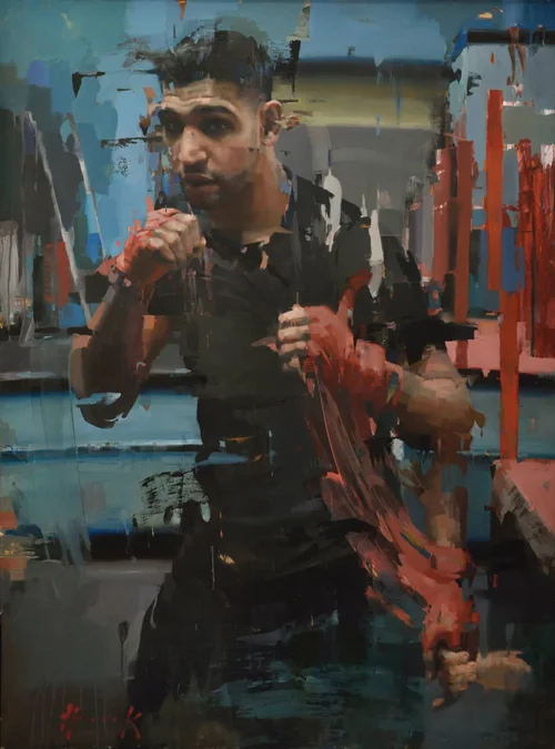
Fig.8. Christian Hook’s portrait of Amir Khan.

Fig.9. Frank Auerbach self portrait 1958 who is Frank Auerbach.


Learning Outcomes
My first reaction whilst doing the self-portrait being removed was that the lack of refined detail made me resemble an Orc from ‘Lord of the Rings’, but there was still a recognisable element and this was very important to learn in Assignment three (along with the research of Rebecca Horn ‘Bionic woman’ where she had to create art whilst bed-bound and used a similar method of extending her reach) and I wanted to take that experience into the personal project to find the outcome of making more gestural marks.
I am becoming increasingly obsessed with the relationship between line and tone within a drawing, and whilst I realise that this is not new and has been discussed many times before – most notably by Harold Speed at the beginning of the twentieth Century. A great deal of my own interest stems from the Charles Bargue Drawing Course that I am doing as part of my personal project as well as course reading materials such as Petherbridge as well as my own passion for drawing and painting. The two (line and tone) are so closely related that they form each other, yet the outcomes they achieve independently of each other are so different in terms of energy and emotion.
I am realising that I can draw a passable likeness of myself ( even if I do look serious when I am drawing). Self Portraiture is no longer as scary as it used to be, I am now looking at different ways of achieving different moods within the drawing.
Inspiration from great masters is always good, either Rembrandt, Caravaggio – although not known for his drawings, but his paintings often include his own image within the composition, or Van Gogh, who were all famous for their self-portraits, as well as contemporary artists like Lucian Freud, and Frank Auerbach.

Caravaggio in particular resonated when I began the course as he defied convention within his time not only by being largely self-taught, but he drew from the early experiences of his own childhood of poverty, hardship and Religious fervour and portrayed devotional scenes by using everyday common people with mud on their feet. This level of realism was the artist being true to himself and what he believed to be right even although it flew in the face of convention of the Catholic Church as it was regaining power after the Reformation and was seeking to use art as a propaganda machine – Baroque painting was approved at this time. The artist is producing fine work by painting what he himself feels, this was apparent in his later work as its mood becomes darker after he commits murder and goes on the run so the artists emotional state is affecting his outcome. Artists like Frank Auerbach today are still trying to channel their emotions into an outcome and relying on their own personal experiences in order to discover their own unique voice within the art world. I feel that this is also an important point for me to grasp along with developing the drawing skills to produce work that is both technically proficient and emotionally charged. (Note the patched paper due to re-working – not archival, but it shows his hard won process)

Through examining my own relationship with line and tone and what I find that I like from artists such as Rembrandt, Van Gogh, Auerbach or Christian Hook, I have realised that drawing does not just rely on classical values, those values are a good foundation to start from, but certainly more emotion and expression can be achieved by pushing the boundaries through line and tone. This realisation has helped me to produce work that I would never have considered myself doing before starting this course.
Looking at the work that I have produced so far it has become clear that I am swaying between two different directions. The first is the classically driven ‘Atelier’ style of portrait which was inspired by my working through the Charles Bargue lithograph course. I have always been attracted to this style of portraiture as I marvel at the artist’s skill with depiction of tone and hue and chroma with brush and palette to depict a human face or figure. The other is the looser, more expressive style that still manages to retain a likeness of the sitter. I am thinking specifically about Frank Auerbach’s self-portrait from 1958 which was worn through and had to be patched in several places before he did a single sitting that he was happy with – he worked in a single sitting and if it wasn’t right, would scrape back or rub it out to start again. There is a combination of line and tone work to produce a likeness with energy and movement or vitality which I am very attracted to. Christian Hook see’s ‘energy lines’ in his subjects which are a key feature of the portrait, but again the likeness of the sitter is unquestionable. This is a key direction that I will follow. I feel that if I was to disregard the best practices of art and be completely wild in order to find a process or an outcome, it would not be a true reflection of me as a person. I am middle aged man with a family and a job who is very interested in techniques and pushing the boundaries by learning techniques to the best of my ability. It might be producing work similar to others, but the end outcome if authentic to myself, will always be unique and original. This is why I am so interested in the classical Atelier drawing techniques and style as I feel that this is the best platform for me to become expressive from. For me, it is essential to produce an accurate likeness of the subject, if you tweak it a little to be more expressive, then that is fine, as long as the likeness remains an integral part of the outcome. I greatly admire Sargent’s loose brushwork or marks and lines, while he retains a great likeness. There is a great artistic skill in such minimal mark-making which I would like to emulate in my own work.


KEY LEARNING POINT
Caravaggio’s use of light and dark suits a tonal approach to work which is softer and moodier than linear work like Van Gogh or Sickert which is harsher and bolder.
The above portrait was carried out on a whim, I wanted to use oils as a medium to provide more half-tones than I was able to achieve with the subtractive technique with charcoal and eraser. I feel that the quickness and energy is shown with the thick paint application as this was painted Alla Prima with no underdrawing. I think this shows that painting and drawing are entwined and not separate practices. Oil paint is perhaps a very forgiving medium to work with because it remains workable until it dries and the large brush I was using was forcing me to be expressive rather than representational. This was the goal from the start and I am happier with this result than the charcoal study earlier.

The above image was a response to attempting a more technical, self-portrait using a pencil which is very linear, and built up tone with careful shading. The eyes capture the viewer with an engaging stare, and I used strong half lighting to create more interesting shadows. There is a case to say that all classically trained artists will produce work that is very similar because they are all taught through the same process, charcoal cast studies, monochrome painting studies, life classes and figure and portrait painting using sight size technique. I am fascinated by this process and very keen to learn more about it and apply it myself in order that I can then take that skill and learning base to another level of expression – rather like contemporary portrait artist Christian Hook, who painted from life every day for a number of years before developing his own style with energy lines. I am interested to see how this will develop, I want to produce work that is both original and authentic and I see this happening by me applying technique to what I see and am inspired by.

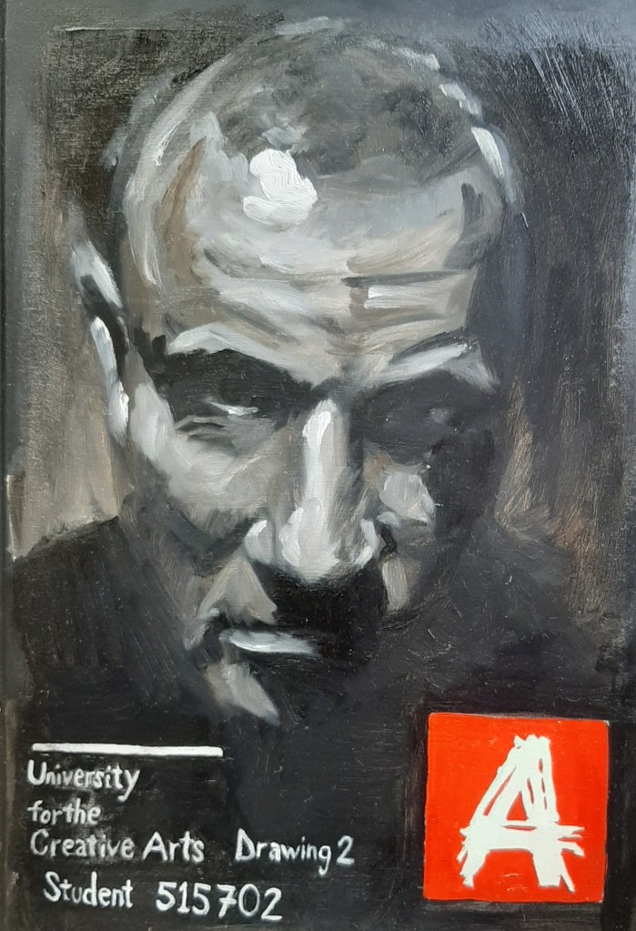
Key Learning Outcome.
In response to the experience of drawing in a classical style from the Charles Bargue Drawing Course exercises, and trying to be more expressive with the use of charcoal and subtractive methods of drawing, I am trying to incorporate elements of both of those styles. The above portrait was a result of me trying to use an underlying representation with the tonal values, then more energetic lines in charcoal over the top. As a follow up to this, I asked a group of my peers to critique a selection of my self portraits for the project and it was interesting that they all agreed that there was a high technical aspect which they could appreciate, but almost unanimously they all found the oil painting self portrait on my sketchbook cover to be more interesting/sinister/powerful/edgy which I was pleasantly surprised by. Again, this confirms Speed’s (1917) ‘dither’ theory about balancing the actual likeness of the sitter, and something else for the viewer to find, an element of soul, a darkness, mood, tension, light, joy…. the list goes on.

This process seemed to form a dialogue as the portrait was progressing. The soft, subtle blending created a warm effect which was in sharp contrast to the more energetic lines which are more edgy in appearance, the bold lines are crisp and solid which creates a relationship with the soft subtle tones and also a edgier feel which I think will engage the viewer on a more psychological level. I experienced this when looking at Frank Auerbach’s self-portrait from 1958.

KEY LEARNING POINT
This influence arose from the subtractive drawing techniques explored in Assignment 2 combined with my own exploration of the relationship between line and tone for my critical essay.


The process of searching for a dialogue between line and tone in this outcome also made me consider the dynamic between finished and unfinished work. Finished work, although describing how light falls on a subject to describe its form more accurately, can become a bit boring to look at. The rough lines of the initial sketch are more exciting simply because they are not polished, yet they still depict the subject’s likeness. This is becoming more apparent to me as the process of producing self portraits goes along. Every finished piece in a classical style began with rougher, gestural marks before being worked over and refined as a part of that process. Sometimes the vitality is lost, and sometimes it stays. By not taking it to a finish, the vitality will definitely remain.

The above portrait in conte noir was an attempt at a more classical or representational style with accurate proportions and tonal values. The direct, front on engaging pose is not a classical pose, but I do like the idea that the viewer should engage with the subject. The strong side light created powerful light and dark which is an interesting compositional tool.
I then tried combining what I learnt from both of these studies to produce a self-portrait in charcoal and white pastel on A2 toned paper that was both fairly representational and slightly abstract. I wanted to create a tension between the light and dark marks of the medium. I also filmed this in a timelapse where you will see the process of drawing, rubbing over and drawing on top where I was allowing the dialogue to develop between line and tone. I was not being a slave to achieving a good likeness ( although I am pleased that I think this has happened naturally) and the process drove itself to the outcome below.

The above portrait was a development from the atelier style classical drawing, and the more abstract use of line and tone. I wanted to push the dialogue that I experienced between the line and tone a bit further so I allowed this to happen with less concentration on producing a finished piece, I smudged over work, re shaped it, rubbed away and added lines as I saw fit. I deliberately worked quickly in order to be more expressive and not overthink the work. I’m especially happy with the following areas.


KEY LEARNING POINT
I am really pleased with this drawing as it has made me re-evaluate my previous understanding of what drawing actually is. In this instance I have produced a piece of work that I never thought I would have through a considered process of work and experimentation. My critical essay has helped to inform much of my thinking as I have been exploring the relationship between line and tone and this has given me the chance to express this through drawing. I can now see that line and tone can produce harsh, brittle, solid linear marks which provide tension for the viewer, while the softer, more subtle tonal elements produce a fuzzy, gentle, and warm feeling. Putting the two together in varying degrees will produce more interesting work I’m sure. For me, I have an underlying passion for representation as a fundamental skill and I want to retain this within my work. With this in mind I am currently enjoying the style of contemporary portrait artist Christian Hook and I feel that I can identify with his technique and would like to take elements of this to incorporate into my own artistic voice and expression. I would urge anyone to read his book ‘La Busqueda’, 2016, published by Clarendon fine arts, London for a more in-depth insight into his unique process. The pictures are also inspirational. There is a quote from Christian Hook in this book (page seventy nine) that I identify with which is as follows.
“Art demands that we take back the rules and the learned and go back to the unlearned. In the moment of destruction I spoil a work I experience true freedom and this is the point at which the reconstruction of something greater begins. As Picasso said every act of creation is first an act of destruction.”
This quote was what inspired me to produce the drawing in the way that I did, building up layers, smudging it out, drawing on top again and allowing the art to happen by being in the moment.
The above influences have led me to do a large scale self portrait where I try to combine my drawing skill (albeit with oil paint), my understanding of other artists methods such as Frank Auerbach and Christian Hook with a little bit of Caravaggio and Rembrandt to produce something that was not only representative, but a bit more expressive in nature. I used a series of my self portraits as reference and worked on a larger scale than ever before after I painted the garage door for Assignment 4 which gave me the confidence to work on a large scale and filmed the process live as a time lapse taking the experience of doing the live demonstration in Glasgow’s Cass Art store from Assignment 5. I did this in two stages as I had to allow the paint to dry in between stages. Taking all of these elements from earlier assignments and pulling together my learning experiences into this final outcome which could have worked pretty well or gone spectacularly wrong, kind of like a high wire balancing act. Fortunately I feel that I was able to take all the relevant learning points from the assignments and push it a bit further by using paint as this is where my next learning point in the next module will be – Painting 2 : Studio Practice. I am particularly pleased with allowing the material properties of the paint to develop its own outcome by building up the mid tones and then the second layer where the stronger contrasts defined form, provided interest and the medium created runs in selected places.
PARALLEL PROJECT FINAL OUTCOME


self portrait oil on gessoed cardboard approx 40″ x 40″.


I was keen to exploit the liquid properties of the paint by allowing runs to happen by using more medium in the second layer, the outcome was uncertain and exciting as well as pushing the tonal and linear qualities within the portrait to provide areas of interest within the work – as discussed in my critical essay on line and tone. Also my student peers all agreed that they preferred my A3 sketchbook cover oil painting self-portrait, so I wanted to develop this further. I was also keen to replicate the black and white charcoal and chalk work of my other portraits by using a monochrome grisaille technique.


Time lapse footage of both stages.
KEY LEARNING OUTCOME
The process of filming myself gave a live performance feel to the work and I found that this nervous energy was something I could harness into the work. I was looking to achieve a more emotional content and therefore the idea of being technically correct was not as important, as long as I still achieved a credible likeness of myself. I was using several different images of my own self portraits as reference, all of which were different angles and tonal compositions so I was taking bits and pieces from each individual portrait to produce this final outcome, essentially this was work which led to more work, very much process driven. Not being overly concerned about technical outcome helped to produce a looser, impressionistic, painterly feel. This was the outcome of the process of work leading to work, something my tutor has been very encouraging that I should explore. I think my own admiration for the style of fractured work by Christian Hook is evident in this outcome, but it is also a result of my own artistic journey through self-portraiture within this module. There have been some very obvious influences from the great masters as well as more contemporary artists and I do feel that I have allowed influences from each to develop my own artistic expression.
Sources
Fig.1. Rembrandt etching, https://www.google.co.uk/url?sa=i&source=images&cd=&ved=2ahUKEwijqKGl4LXlAhULzhoKHexSAfsQjRx6BAgBEAQ&url=https%3A%2F%2Fhyperallergic.com%2F127726%2Fmorgan-library-puts-hundreds-of-rembrandt-etchings-online%2F&psig=AOvVaw2U4hh8kWihahvVDhtchGZd&ust=1572035913139718 Accessed September 2019.
Fig.2. Rembrandt etching, https://www.google.co.uk/url?sa=i&source=images&cd=&ved=2ahUKEwib9r294bXlAhURCxoKHfICCgkQjRx6BAgBEAQ&url=https%3A%2F%2Fwww.swanngalleries.com%2Fnews%2F2018%2F05%2Frembrandt-self-portraiture-etchings%2F&psig=AOvVaw2U4hh8kWihahvVDhtchGZd&ust=1572035913139718 Accessed september 2019.
Fig.3. Rembrandt etching, https://www.google.co.uk/url?sa=i&source=images&cd=&ved=2ahUKEwjb2sbD4rXlAhUKxoUKHbUVB3sQjRx6BAgBEAQ&url=http%3A%2F%2Fcanjournal.org%2F2018%2F02%2Frembrandt-etchings-academic-museums-continue-inspire-engage%2F&psig=AOvVaw2U4hh8kWihahvVDhtchGZd&ust=1572035913139718 Accessed September 2019.
Fig.4. Van Gogh etching, https://www.google.co.uk/url?sa=i&source=images&cd=&ved=2ahUKEwjHvoap47XlAhUH8BQKHXBRACgQjRx6BAgBEAQ&url=https%3A%2F%2Fwww.pinterest.com%2Fpin%2F634022453762474916%2F&psig=AOvVaw2OFF0xn942sHMYgxCy2YUU&ust=1572036727230757 Acccessed September 2019.
Fig.5. Rembrandt, self portrait with tousled hair 1629, ink.http://www.rembrandtpainting.net/slf_prtrts/slf_prtrts_imgs/self_portrait_drawing.jpg Accessed September 2019.
Fig.6. Jim Shaw ‘Dream object: Student art, Tornado ‘Oism’ series. https://www.google.co.uk/url?sa=i&source=images&cd=&ved=2ahUKEwii8Mm6xIDnAhXc6eAKHVhNDu8QjRx6BAgBEAQ&url=https%3A%2F%2Fwww.mutualart.com%2FArtwork%2FDream-Object–Oism-Student-Art–Tornado-%2F5EF239AB4FF70CCE&psig=AOvVaw2eqX_IgX5gCZldhFZKuFZS&ust=1579003463153014 accessed January 2020.
Fig.7. Jim Shaw ‘Simon Lee’ series. https://www.google.co.uk/url?sa=i&source=images&cd=&ved=2ahUKEwjwyvLOxYDnAhV55OAKHajgDIoQjRx6BAgBEAQ&url=https%3A%2F%2Fwww.simonleegallery.com%2Fartists%2Fjim-shaw%2F&psig=AOvVaw2eqX_IgX5gCZldhFZKuFZS&ust=1579003463153014 Accessed January 2020.
Fig.8. Portrait of Amir Khan by Christian Hook, https://images.squarespace-cdn.com/content/v1/57ceaf32e58c6267c22de2ad/1474457096409-V96HTCY13P9VCZMVH28X/ke17ZwdGBToddI8pDm48kJ3VcBqo7-adxXx1a7Ek9I97gQa3H78H3Y0txjaiv_0fDoOvxcdMmMKkDsyUqMSsMWxHk725yiiHCCLfrh8O1z5QPOohDIaIeljMHgDF5CVlOqpeNLcJ80NK65_fV7S1UUYO3oJ-5yVo3u_UZA9SXtkWm7VhLEOKCUtgV4w2P8lN9rqXAfhqx7nqq9zlU6uspg/1962374_597944006972312_1803970162221300841_o.jpg?format=500w Accessed January 2020.
Fig.9. Frank Auerbach self portrait 1958 who is Frank Auerbach, https://www.google.co.uk/url?sa=i&url=https%3A%2F%2Fwww.artsy.net%2Fartwork%2Ffrank-auerbach-self-portrait-1958&psig=AOvVaw1DgHopCPuBJxt8zjESjFAR&ust=1596626353909000&source=images&cd=vfe&ved=0CAIQjRxqFwoTCPju2-q2gesCFQAAAAAdAAAAABAD Accessed January 2020.
Reference books
Graham-Dixon, Andrew, 2010, ‘Caravaggio – A Life Sacred and Profane’, Penguin.
Hook, Christian, 2016, La Busqueda, Clarendon Fine Arts, London.
Schutze, Sebastian, 2009,’Caravaggio – The Complete Works’, TASCHEN Bibliotheca Universalis, printed in China.
Speed, Harold, 1917, ‘The Practice and Science of Drawing’
Petherbridge, Deanna, 2010, ‘The Primacy of Drawing’
